

When a website is ADA (Americans with Disabilities Act) friendly, it means it’s designed to welcome and accommodate everyone, including people with disabilities. It’s about inclusivity and making sure no one is left out. Just as you’d want every guest at a party to have a great time, you want everyone visiting your website to be able to access information and services easily, no matter what challenges they might face. While this may seem daunting, keeping these tips in mind can go a long way to help make your site more accessible.
Nesting isn’t just for the birds
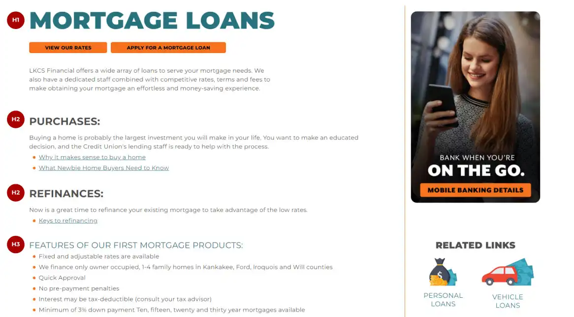
Using headings in the correct order (h1, h2, h3, etc.) is crucial for accessibility and user experience. Headings give a clear order to the information on a page, helping users navigate and understand the content better. People using screen readers often jump from heading to heading to browse a page quickly. Good headings make it easier for them to find what they need without listening to every single word. Using headings out of order or skipping levels (e.g., using h2 before h1, h3 before h2, or h6 after h1) can confuse these technologies and make the content difficult to follow for users with disabilities.
Context Clues
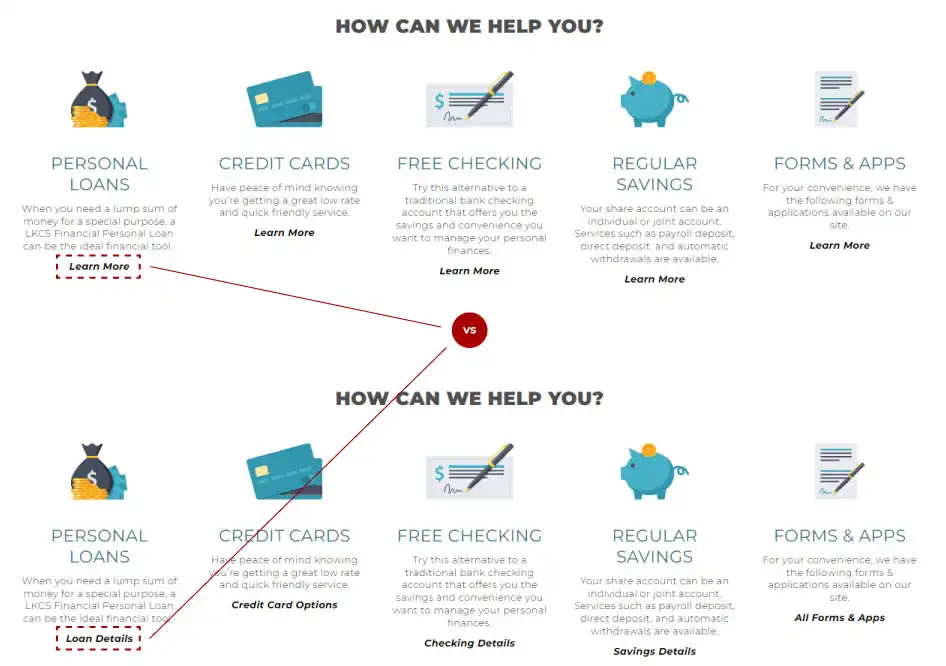
Visitors using screen readers to navigate websites often use lists of links. Link text like “Click here” or “Read more” lack context and these users may not understand where the link leads or its purpose. Choose specific wording and avoid generic phrases that don’t explain the link’s purpose. It’s important to ensure link text clearly describes the destination or action, like “Learn More About Certificates” or “Apply for an Auto Loan” vs. “Learn More” or “Apply Now”. You can also talk to your website service provider to see if it’s possible to add text hidden from view but available to screen readers to keep the links visually short while also being descriptive.
Beyond Mainstream: Explore Alternative Text
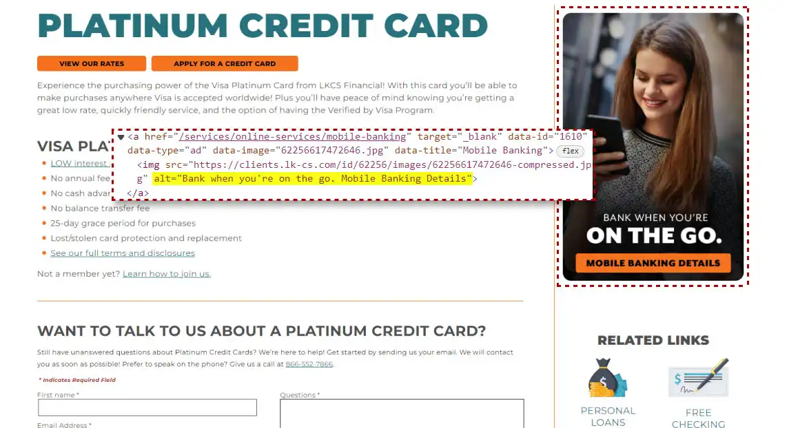
Alt text for images such as banners and ads is essential for people who are blind or have low vision and use screen readers to navigate websites. It gives them a text description of the images, ensuring they understand the meaning and context the visuals convey. Without alt text, these users would not be able to access this information. Focus on conveying the essential information the image is intended to communicate. Aim for a brief description that provides enough context without being too wordy. Screen reader users typically prefer alt text that is concise and to the point.
Too Much of a Good Thing
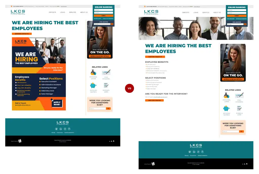
You might encounter situations where an image contains extensive text or complex information presented in tables or charts. It can be challenging to keep the alt text concise while effectively conveying the content. Consider breaking up the image content and integrating the information directly into the HTML content of your site. Tables, charts, paragraphs of text, and even photos with captions are more accessible when presented as separate elements of HTML and text rather than as complex images alone. This approach ensures that all users, including those relying on assistive technologies, can easily understand and interact with the information.
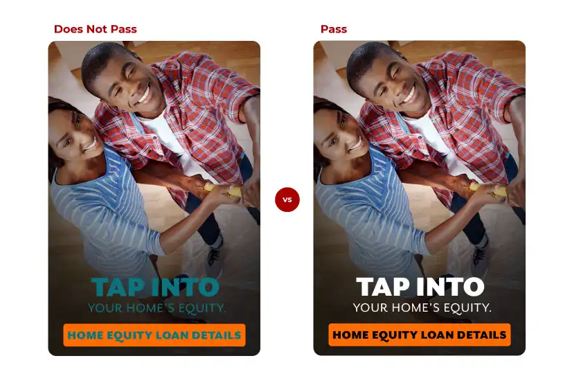
Compare and Contrast
While you’re focused on your images, take a moment to make sure any text on them passes contrast guidelines. For regular-sized text (18 points or smaller), it should have a good contrast ratio (4.5:1 or more) with the background to make it easy to read. Larger text, like headlines or important info, it can have slightly lower contrast (3:1) but still needs to be clear. When in doubt, it’s always better to go with more contrast. Online tools such as WebAIM, can help you choose colors with the proper contrast ratios when creating your banners.
By following these simple steps, you’ll enhance the accessibility of your website while also improving the overall user experience for everyone who visits.
Did you like this blog post?
Get more posts just like this delivered twice a month to your inbox!
