Did you know, there are certain elements to financial websites that are an absolute must-have? Below is a list of the five most common must-haves that we include in our website builds – but does your current website meet these requirements? If not, now might be a good time to consider making some changes to include them!
Online Banking Login

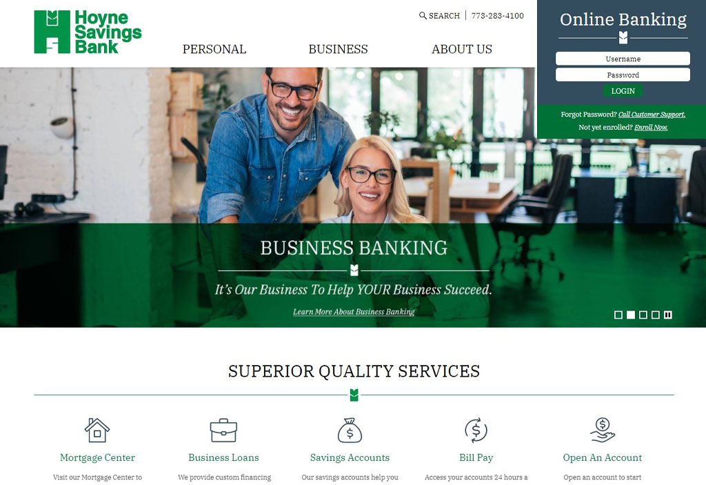
Your customers may not always want to or even need to make a journey to their financial institution. And even now, with the COVID-19 pandemic upon us, it’s more important than ever that you give your customers/members immediate and convenient online access to their accounts. With online banking, this allows individuals to log-in with personal login credentials and take care of simple financial transactions such as bill pay and transferring funds from one account type to another.
Website Accessibility Page
A website accessibility page gives a standard explanation that you, as a financial institution, are actively working to create a welcoming web environment for those with disabilities. This page also will typically include information on how to contact you if a problem is encountered on the website, allowing the opportunity for those potential issues to be corrected.
Privacy Policy
The privacy policy page explains, as required by federal law, what kind of information your financial institution might collect and share, as well as outlining the safe and secure protection of any personal information.
ADA-Friendly colors/programming
Business related websites are required by law, to meet compliant standards under the Americans with Disabilities Act (ADA). This is to ensure that anybody with vision and/or hearing impairments are able to access the same information as those without disabilities. Failure to do so can eventually result in legal action. Some of these things include the use of a friendly mix of readable colors, and the use of Alt Text (for screen readers) where necessary.
External Link Pop-Up

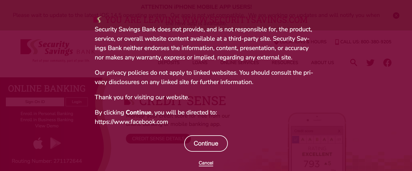
If your website includes links to any external websites, you’ll want to include a pop-up notification for the user letting them know they are leaving the current website, and that you’re not responsible for the content the external site might contain. This also gives the user the opportunity to decide if they’d like to proceed, or remain on the current web page.
These are the basic requirements for bank and credit union websites. To see more designs and features that can improve the user experience for your account holders, please check out web design portfolio for inspiration.
Did you like this blog post?
Get more posts just like this delivered twice a month to your inbox!


