Working with typography is oddly, probably one of the most fun parts about this job for me. I can spend hours working on an overall layout and that’s fun too, but when I find that perfect font for whatever project I may be working on, that’s when I get excited. Everything is beginning to tie together and the project starts to feel complete. The average person may think nothing of it. But as a designer, the font choices really do matter! Here’s why:
Readability
Readability is the most important thing to keep in mind while designing an advertisement. Makes sense, right? You’re trying to put a message out to a particular audience, or maybe even a more universal audience. But in any case, you really need to make sure they’re able to read and connect with your message.

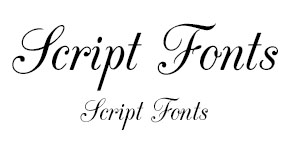
SCRIPT: The style of script fonts can vary from being playful to very elegant. They should be used with care, and at the right time. The smaller scripts become, the more difficult they can be to read. So, if they’re going to be used at all, script-based fonts are best used in headlines, as oppose to smaller body text. And even then, you really want to still make sure that your text is readable.

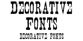
DECORATIVE: Like script fonts, should be used with care and at the right time. On a case-by-case basis, they can at times also be difficult to read. But there are all kinds of crazy looking decorative fonts out there, and while they do look really fun and can even be pretty tempting to use, they should make sense and even look good with the project at hand.

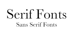
SERIF: Identified by the decorative embellishments that hang off the ends (called serifs), these fonts are widely used and can give a very simple, yet classic look to any design. They’re even typically readable in any size, whether they’re used in a headline or the body text.

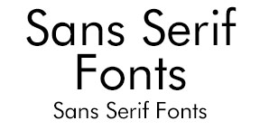
SANS SERIF: Identified by their lack of serifs, these fonts can give your advertisements a more modern and cleaner look. They are also widely used and often times is my more favored choice because I find them to be pleasing to the eye.
Visual Transformation

With readability in mind, fonts can visually transform an overall advertisement, and even have a positive or negative impact on the message of the advertisement itself. So, the visual appeal of your ads, or lack of appeal, can directly affect the amount of attention your ad receives from the consumer.

Your Audience
Your font choice might also depend upon who your target audience is, or even the subject you are advertising. A specially selected font, no matter what it is, could be the oomph needed to get your message across to those you intend on.
Don’t be afraid to experiment and play around with your options. Think outside the box! Choosing the perfect font is an important piece of the puzzle and can make a huge difference in the amount of attention your advertisement receives.
Did you like this blog post?
Get more posts just like this delivered twice a month to your inbox!


