

Navigating a financial institution’s website can sometimes feel like walking through a maze. With numerous services, accounts, and resources to sift through, it’s essential that your navigation design is easy to understand and organize. Clear navigation can make the difference between a satisfied user and a frustrated one. Here are some best practices to ensure that your financial website is user-friendly and efficient.
Keep It Simple
Simplicity is the ultimate sophistication, especially when it comes to your website’s navigation design. Financial websites tend to contain a lot of information, but the key is to make complex information accessible and easy to find. Simplify your site navigation by limiting the number of menu items and categorizing services in a way that resonates with users’ habits and mindset of banking and finance.
Use Understandable Language
Finance is full of jargon that can be intimidating for the average user. Your navigation should avoid industry-specific terms in favor of plain language that everyone can understand. This ensures that your customers feel confident navigating your website and can find the information they need without getting lost.
Organize Layout Highlighting Important Actions
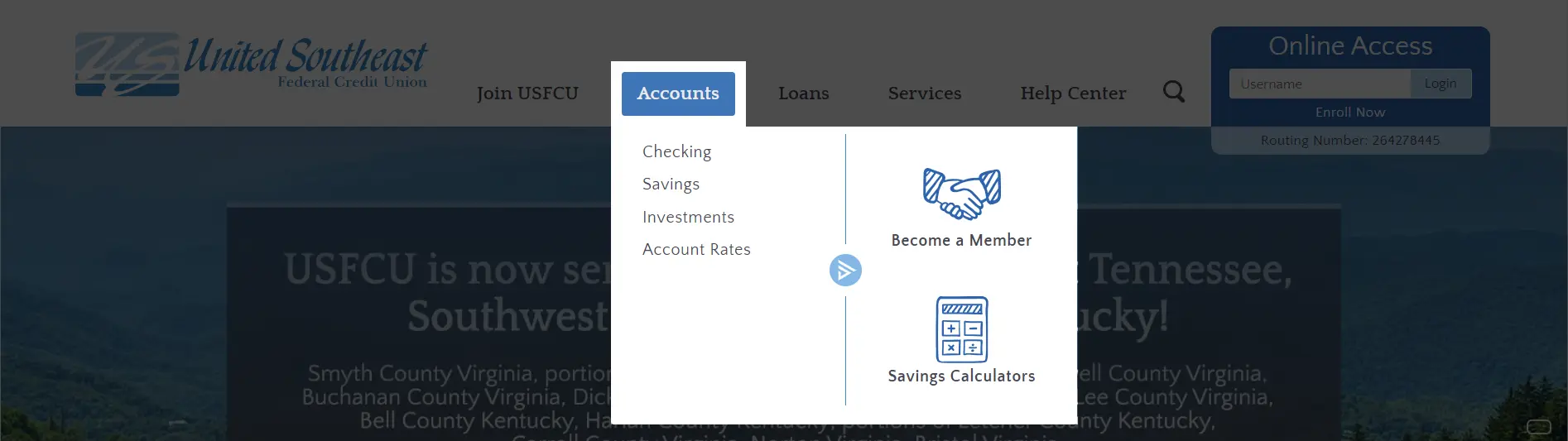
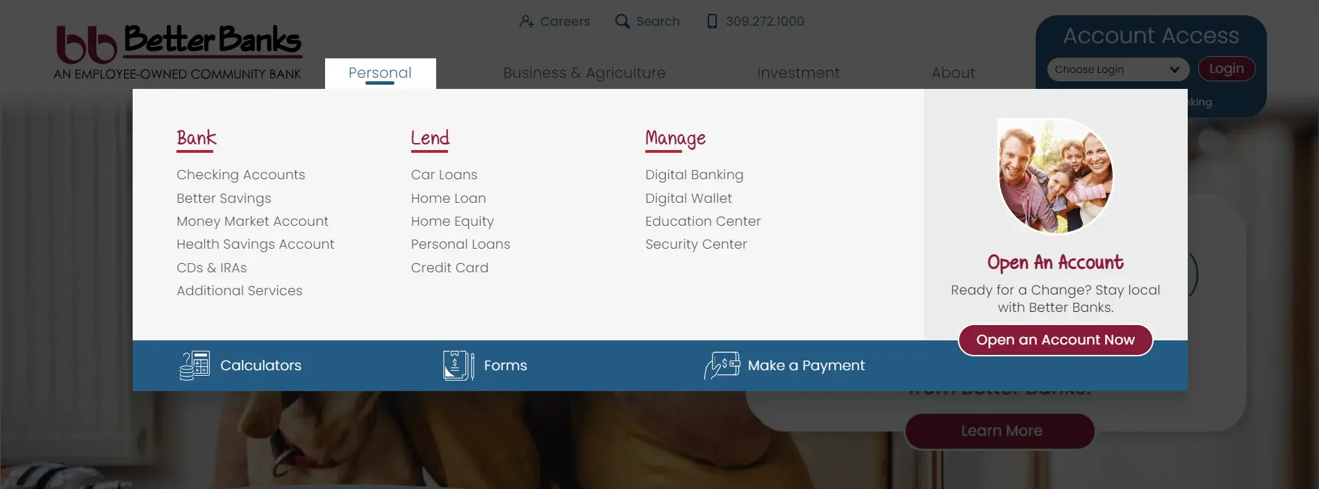
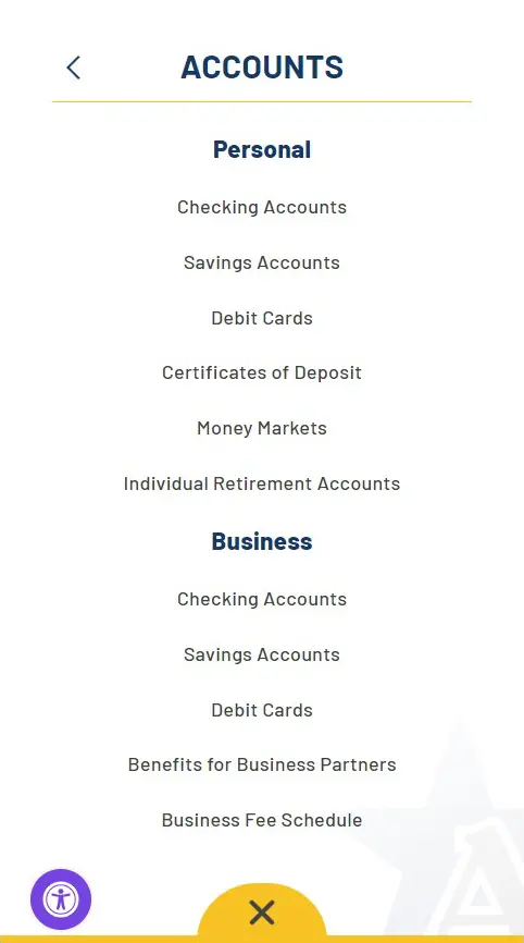
The layout of your navigation should logically guide users to the information they are seeking. Implement a hierarchical structure with broader categories such as Bank, Borrow, etc. which lead to more specific topics for accounts, loans, services, etc. Consider features like mega menus for complex sites, which allow users to see all their options at once without overwhelming them.
The navigation is also a great opportunity to guide your users to take actions that are critical to your business, such as opening an account, contacting a representative, finding branch and ATM locations, or accessing their transaction history. Use visual cues such as buttons or icons in your navigation to draw attention to these important actions.
Make It Accessible
Financial institutions serve a diverse range of users with varying abilities. Make sure your navigation design complies with the Web Content Accessibility Guidelines (WCAG) to accommodate users who may rely on assistive technology. This includes providing keyboard navigation and ensuring sufficient contrast ratios for users with visual impairments.
Offer Search Functionality
Sometimes users know exactly what they are looking for and would prefer to bypass browsing through menus. Include a search bar that’s easy to locate and use, so users can quickly find specific information or services.
Test and Get Feedback
The best way to determine if your navigation design works is by testing it with real users. Gather feedback from a variety of users and use that information to refine and adjust the navigation to better meet their needs.
Closing Thoughts
Navigation design plays a pivotal role in the user experience for financial institution websites. By adhering to these best practices, you can ensure that your site is not only compliant and functional but also provides a smooth and intuitive user experience. Remember that the design process is iterative; always be ready to evolve your navigation to meet changing user needs.
The navigation of your website is the map to your services; make sure that map is clear, accurate, and easy to follow.
View our website design portfolio for more navigation ideas. For more information on creating a seamless online experience for your financial institution, contact us today.
Did you like this blog post?
Get more posts just like this delivered twice a month to your inbox!
