

There are thousands of typefaces available for use in personal and professional projects. Some even offer a vast variety of styles and weights. So many choices, in fact, that sometimes it’s difficult to decide which to use. Sure, Helvetica and Times New Roman are safe bets. But wouldn’t you like to explore some different options?
Well, let’s get started then! I’ve asked a few LKCS designers to share their current favorite typefaces. Maybe these examples will open up new possibilities for your next project.
Current Favorite Go-To Typefaces
Oh, these were hard to narrow down to just one favorite! Newer typefaces are being introduced all the time – even as I write this. No doubt some of them might easily replace these selections.
Here are a few of the typefaces the designers mentioned they like incorporating into their work:
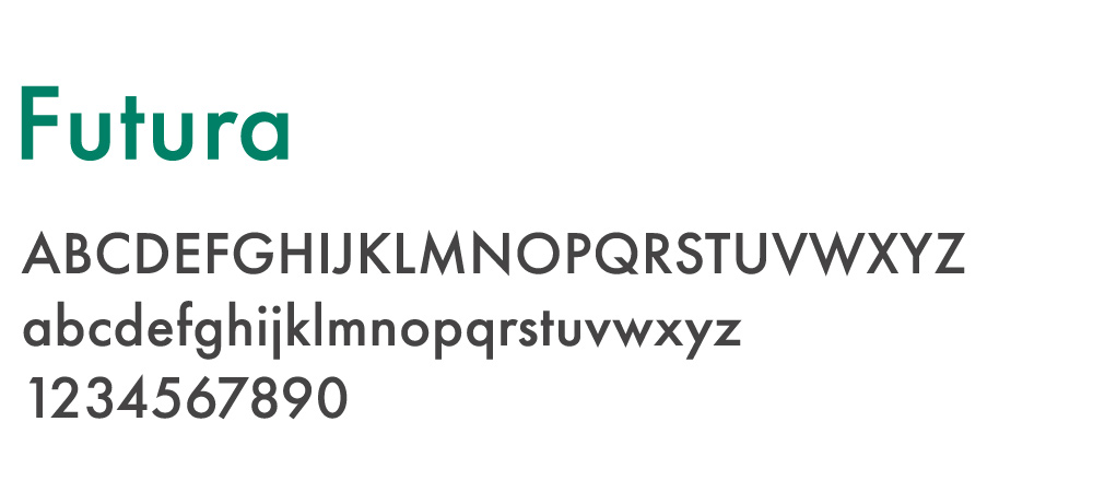
Angie says:
I lean more towards sans serifs because they look clean and modern. Along with that, Futura looks very geometric, and I think that might be why it stands out to me. I like the name too!
James says:
There are a wide range of weights. It’s easy to read and looks good large or small. For the most part, kerning is very good.
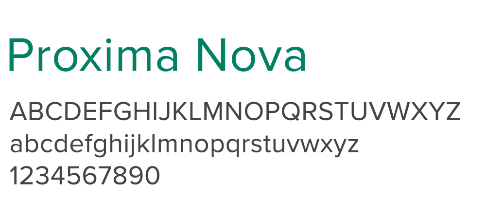
Jessica says:
Proxima Nova has a strong feel to it but it’s softened with rounded letters like the lower case “a” or upper case “s”. It almost reminds me of the letters that kids trace to learn how to write. But it’s definitely not a kid’s or school font. It can be used for any type of business or design project that wants to look friendly and inviting.
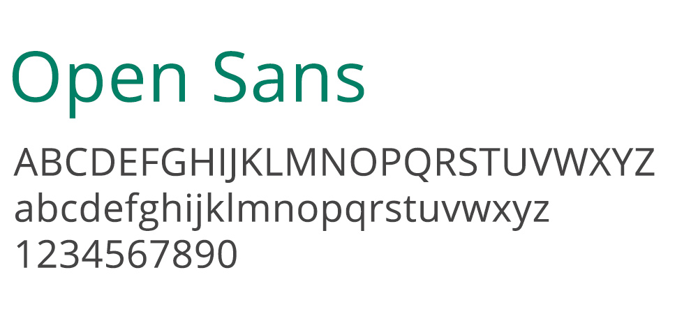
Janet says:
I think this font is very reader friendly. I also think the lower-case letters have a bit more character (look at a and g) than some of the other fonts currently trending. There are many different weights offered with this font, which is a definite must for me when working on print projects.
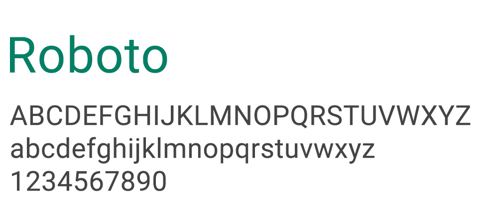
Ryan says:
I think Roboto is a good sans serif alternative to Arial. I’ve used this one on several websites for body copy and some headlines.
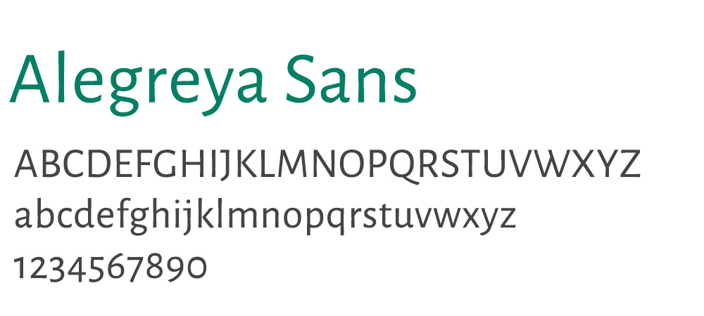
Janet says:
I like this font for copy heavy text because it’s space efficient. I also think it has a friendlier, casual feel. Its slight calligraphic influence adds more visual appeal to the typeface, and I believe it helps with legibility. However, I always modify the numbers to Proportional Alignment so they all sit on the same baseline.
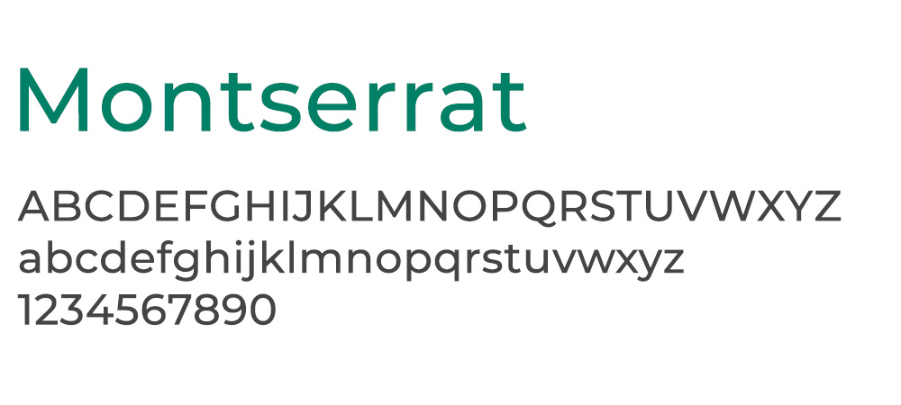
Jessica says:
Montserrat is free and really versatile. It can make a design look modern or classic depending on the font it’s paired with. It can work as a headline or as your body text thanks to the various weights it comes in. You could even use it for both elements because the weights have a distinct feel from each other.
Fun and Exciting Fonts
Although these fonts would be used sparingly, they can provide a bit of visual variety to your work. Here’s some of the top picks:
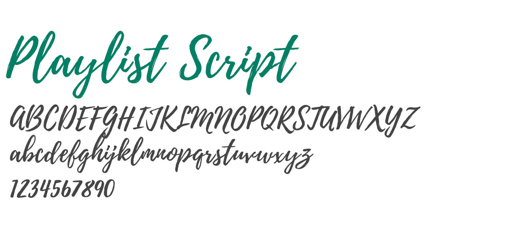
Jessica
Playlist Script is a very trendy font right now. You’ve seen it all over recipe and parenting blogs or on customizable mugs in Etsy stores. Still, it’s great for creating a laid back and accessible design for things like social media campaigns or event invitations. There is also an uppercase version which pairs well with the script part.
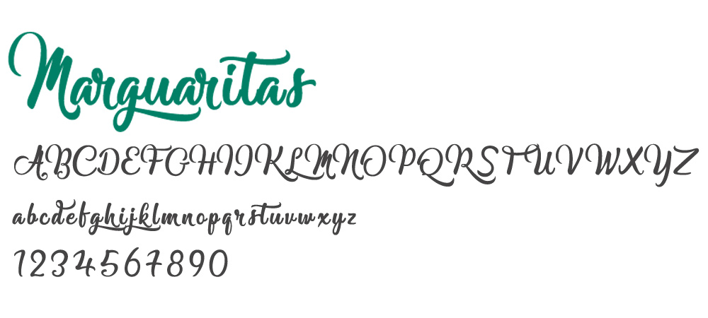
Karen says:
Marguaritas is a beautiful modern calligraphic font. This is a flowy script font with stylistic swashes that smoothly transition from one letter to the next.
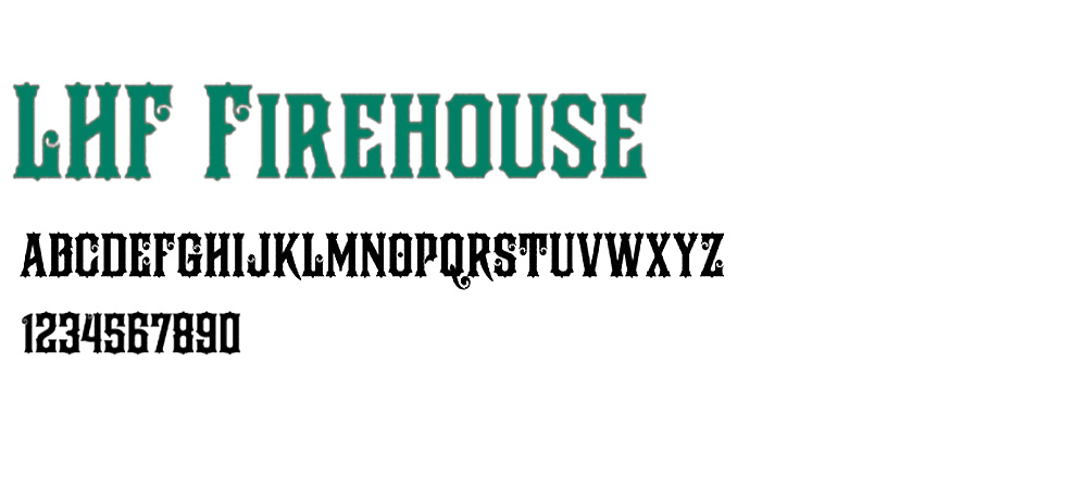
Ryan says:
I’ve always been interested in old western fonts, so to create something with a similar look and feel would be fun.
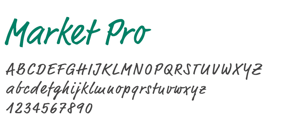
Karen says:
The design of the Market Pro Font is inspired by a flat blush typeface with varying weights. It is unique that it can serve as a modern script typeface while also serving as a carefree typeface, such as hand lettering.
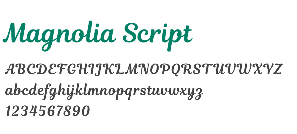
Janet says:
I think this script font is no nonsense and easy to read. There are not a lot of flourishes or swashes to distract your eye when reading. It’s designed so that each character connects nicely with the next.
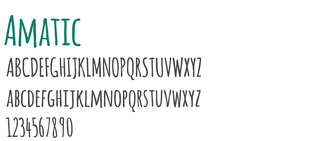
Ryan says:
I am a fan of handwritten fonts. I like Amatic’s rustic look and could see it used as a headline in an outdoors magazine or website.
Stay tuned
If you’ve enjoyed learning about some of our most admired typefaces, check back soon. I’ll post part two: The Typefaces that Drive LKCS Designers Bonkers!
Until then, be sure to try out a few of the suggestions we’ve made!
Did you like this blog post?
Get more posts just like this delivered twice a month to your inbox!
