

Maintaining brand standards throughout all your marketing efforts is the key to ensuring people are familiar enough with your financial institution to trust that when you advertise your products and services you are consistently offering the same value each and every time. Your message needs to be clear and not change every other time you relay it to someone. Current and potential account holders are more likely to invest their time and money in a brand they recognize and trust. This doesn’t happen overnight – building that level of confidence takes time. Consistent branding is an ongoing process.
From the first impression your brand offers audiences to each time its tone and look evokes a memory, consistent reinforcement of your brand is needed to get people to respond and buy into it.
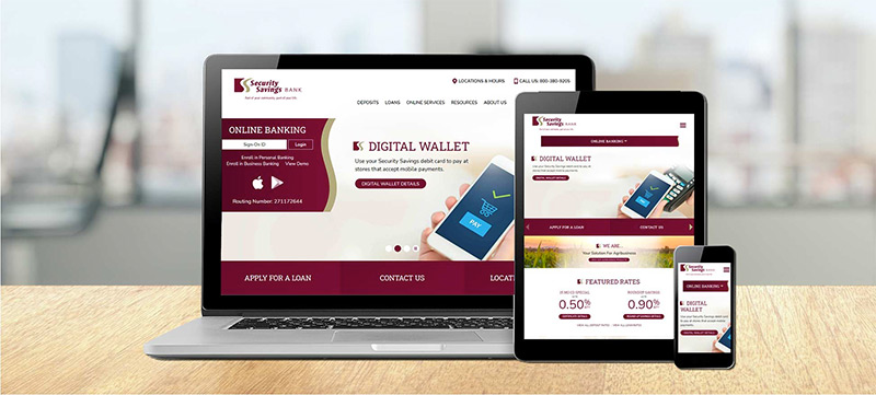
For a financial institution, consistent branding means keeping everyone on the same page. Each staff member should be familiar with your brand standards. Create and save a brand standard guide that is easily accessible to everyone from tellers and loan officers, right on up to the President/CEO. Setting up some templates for written correspondence and emails and common advertising formats are great ways to assure your brand remains consistent, regardless of who authors it.
A brand standard guide gives in-house staff and outside vendors a glimpse at what it takes to uphold the integrity of the brand you’ve built. At its most basic form, the guide shows the proper proportion and placement for your logo, primary and secondary typography, and a suggested color palette. A more inclusive manual might also offer verbiage that reflects your brand’s tone for phone conversations and radio advertising. Including sample layouts in the guide which show branding features in place and used as they were intended helps eliminate the possibility of straying off course with the brand.
Let’s look at some of the standards addressed within a brand guide to understand how they play a role in building trust in your bank or credit union.
Color
Picking a color palette centered around your logo colors is a good starting point. But from there, it’s good to add some secondary colors for contrast or emphasis.


Consider cool colors such as blues and greens to suggest calm and peacefulness. These are two of the most utilized colors to convey feelings of trust, stability and growth.

Reds in the financial world are generally shied away from since it is associated with loss. As long as it isn’t being used in an Annual Report, reds are attention getters that command a sense of urgency. For example, sending out a correspondence with the words “Final Notice” in red definitely grabs the eye, especially if that is the only spot of red you see on the page.

Yellows are bright and cheerful and scream happiness. However, it works best as a background color and should never be considered as a primary text color.


Tans and browns are viewed as conservative colors, and much like grays which are considered as neutral colors, are paired nicely with blues and greens.
Typography
Printed text has personality. Make sure it aligns with the image you want your financial institution to portray.
Serif fonts tend to exude a professional vibe and are closely associated with common descriptive words such as Classic, Trust, and Stability.
Whereas, sans serif fonts are generally viewed as casual, with words like Modern and Clean describing them.

If you want the best of both worlds, combine the serif with the sans serif. Use one for headlines and the other for body copy.
In communications where there is no one-on-one conversation, especially in web design, your text needs a voice. The tone of your communications should echo your brand. It can be casual and informal or technical and precise. But be careful – grammatical errors in text will tarnish trust, as will misleading claims.
Highlight key information with bold text or a larger point size or perhaps add more emphasis with italics or color. If you need to disclose regulations, it’s acceptable to keep the text small, but not so small it appears you’re hiding something.
Remember, how your words resound with your audience will determine whether people will decide to trust in your brand.
Photography
Finding a face for your message can be somewhat challenging. Be mindful of the images you choose when selecting or shooting photos. Keep your target market in mind. Are you advertising to young adults, senior citizens, or maybe a specific ethnicity? Consider cropping a photo tightly in order to eliminate emphasis on certain particulars, such as an age group or heritage, which may leave the majority of your recipients feeling like your message doesn’t apply to them.

Don’t overlook facial expressions when choosing photos for your financial newsletters and social media posts. Happy, smiling faces suggest a positive experience. An expressionless face could make potential account holders skeptical of the customer service your bank or credit union provides to its account holders. Lifestyle photos showing people relating to each other or in a realistic setting resonate better with audiences rather than staged studio shots, which seem controlled and not as believable.
Also, keep in mind casual clothing can make staff appear more approachable, but it’s generally considered less professional than business attire. In the financial realm, most people embrace casual for tellers, but may consider a loan officer to be more trustworthy and knowledgeable if they wear suits and ties. On the other hand, your audience will relate to the average Joe when representing the account holders. He or she is the person that isn’t the most attractive or the best dressed – they look like anyone you might meet on the street.
You Can Trust Us
Have you considered how your financial institution presents itself to current and potential account holders? Think about it: Your brand presence can convince someone of your trustworthiness. If you’re not already doing so, consider investing in quality graphic design for your financial institution to help build and maintain that trust. Need some help? We Do That.
Did you like this blog post?
Get more posts just like this delivered twice a month to your inbox!
