

How to Use Them Responsibly—Especially on Mobile
Website pop-ups are one of the most misunderstood UX tools. Marketers love them because they convert. Users often dislike them because—well—they interrupt. The reality is somewhere in the middle: pop-ups can be incredibly effective when used responsibly, and incredibly harmful when they’re not.
Mobile devices raise the stakes even more. With limited screen space and different user behavior patterns, an otherwise harmless pop-up can suddenly become a major barrier.
Let’s break down how pop-ups go wrong on mobile, how to use them responsibly, and three timing rules that will keep your experience user‑first.
When Pop-Ups Become a Problem on Mobile
A pop-up that might feel subtle on a laptop can completely derail the experience on a phone. Here’s when they cause trouble:
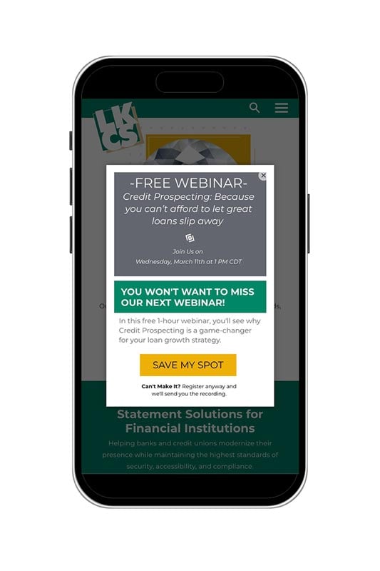
- When they cover up essential content
Mobile screens are small. A pop-up—even a small one—can quickly hide the navigation, product details, images, or online banking login. This forces the user to dismiss it before they can do anything meaningful. - When the close button is too tiny
On mobile, fine-motor actions matter. A small “X” in the corner can frustrate users trying to tap it. If closing the pop-up takes too much precision, many users simply abandon the page. - When they load too fast
If the first thing users see is a pop-up—before they even understand where they’ve landed—they’re far more likely to view it as intrusive. It’s like someone shouting at you the moment you walk through a door. - When they break the layout
Unoptimized pop-ups can shift content, cause scrolling issues, or push layout elements off-screen. This isn’t just annoying—it can feel untrustworthy.
How to Use Pop-Ups Responsibly on Mobile
Pop-ups aren’t the enemy—poorly timed and poorly designed pop-ups are. A responsible pop-up:
- Is easy to dismiss
- Doesn’t cover the entire screen (unless it’s legally required, like cookie consent)
- Has clear purpose and value (discounts, reminders, sign-ups)
- Respects the user’s intent
- Is designed specifically for mobile, not just resized from desktop
- Most importantly: it never stops the user from completing what they came to do
Three Rules for Smart Pop-Up Timing
Timing can make the difference between effective and annoying. Here are three user-first rules to follow:
- Avoid Immediate Load
Never show a pop-up the moment the page loads.
Instant pop-ups:- Interrupt user orientation
- Feel more aggressive
- Increase bounce rates, especially on mobile
Give users a moment to breathe and understand the context of the page.
Good rule of thumb:
Wait at least 5–10 seconds or after the user scrolls 25% down the page. - Trigger After Engagement
Only show pop-ups once users have shown intent, such as:- Scrolling
- Clicking a link or menu
- Browsing multiple pages
- Showing exit intent (more applicable on desktop)
This respects the user’s journey and makes the pop-up feel helpful—not disruptive.
- Cap the Frequency
Nobody wants to close the same pop-up over and over.
Set limits such as:- Show once per session
- Don’t repeat on every page
- Don’t show again for 7–30 days after dismissal
Frequency caps keep your brand from feeling spammy and reduce friction on mobile.
- Timing
- Layout
- Size
- Copy
- Mobile vs. desktop interactions
- Dismiss buttons and gestures
Keep It User-First—and Test Everything
The best pop-up strategy is one built around your audience’s behavior, not assumptions. What works beautifully on one site can flop on another. That’s why testing is essential.
A/B testing, session recordings, and analytics will tell you exactly when a pop-up helps conversions—or when it’s driving people away.
Final Thoughts
Pop-ups aren’t inherently good or bad. They’re tools—and like any tool, their impact depends on how they’re used. By keeping your design user-first, timing them thoughtfully, and shaping the experience for mobile, you can turn pop-ups into a website asset rather than a barrier.
Did you like this blog post?
Get more posts just like this delivered twice a month to your inbox!
