


When people hear the term ADA accessibility, they often picture complicated code, expensive website projects, or something only a developer can handle. The good news is that isn’t usually the case.
If you update your website through a content management system like WordPress or Sitefinity, there are plenty of simple changes you can make yourself. Most only take a few minutes, but they can make a big difference for people using screen readers, keyboard navigation, or other assistive technology.
Even better, many of these improvements make your website easier for everyone to use, not just people with disabilities.
Here are five easy places to start.

1. Add Descriptive Alt Text to Images
Alternative text or “Alt text” is simply a short description of an image. Screen readers use it to tell someone what the image shows.
Instead of using something like “image1.jpg” or “photo,” describe what someone would actually see.
For example:

Rates as low as 3.99% APY*. Learn More About Certificates
If an image is only there for decoration and doesn’t add any information, you can leave the alt text blank so screen readers skip over it.
2. Use Headings to Organize Your Content
Think about how you read a webpage. Chances are you scan the headings first before deciding what to read.
People using screen readers do something similar. They often jump from heading to heading to find the section they need.
A simple heading structure looks like this:
- H1 for the page title
- H2 for the main sections
- H3 for sections within those sections
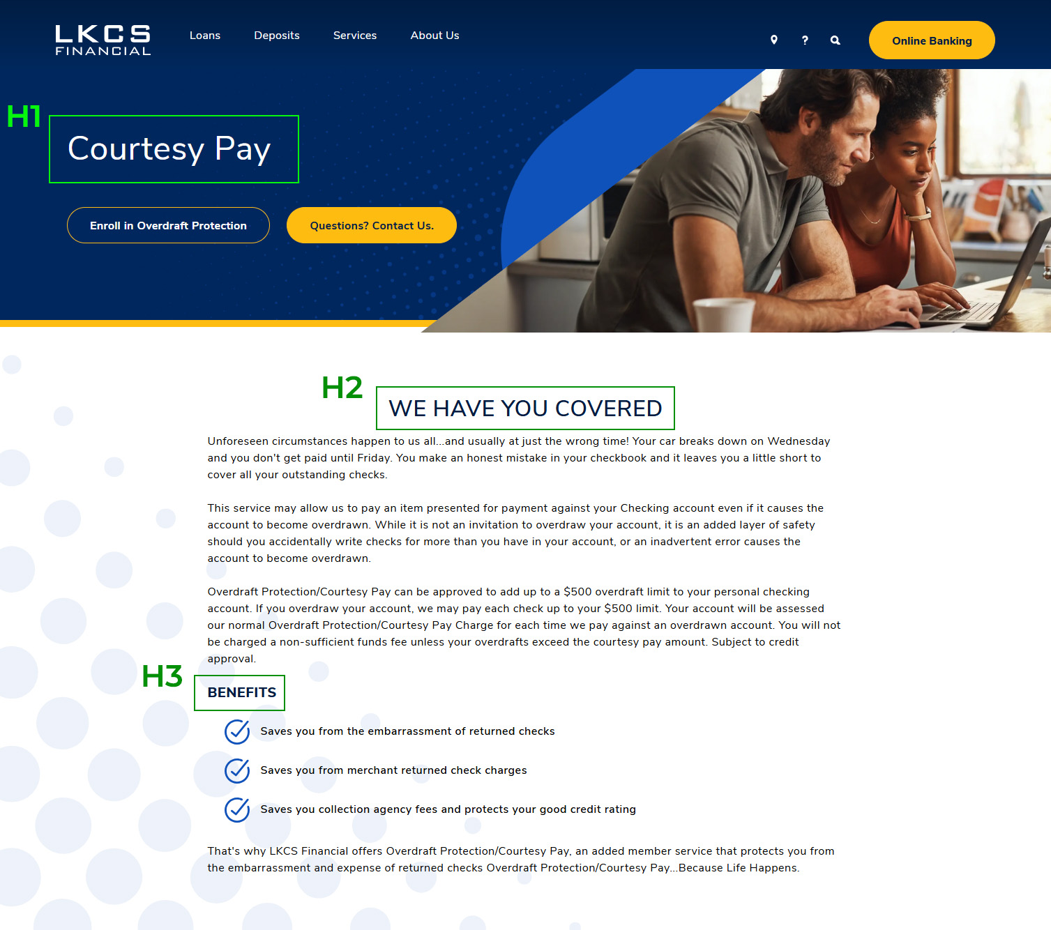
Instead of making text bigger or bold to look like a heading, use the heading styles built into your CMS. They create the page structure that screen readers rely on.

3. Create Meaningful Links
We’ve all seen websites full of links that say “Click Here” or “Learn More.”
The problem is those links don’t describe their destination, so people have to rely on the surrounding text to understand where they’ll take them.
Someone using a screen reader can pull up a list of every link on a page. If they all say “Learn More,” there’s no easy way to tell them apart.
Instead, be specific.

For example:
- View Rates
- Open an Account
- Download Our Annual Report
The more descriptive your links are, the easier your website is to navigate.

4. Make Tables Easy to Read
Tables are great for showing rates, fees, account comparisons, and other financial information. But they need to be built correctly so screen readers can read them in the right order.
A few simple tips:
- Keep tables simple and easy to follow. Consider whether the information can be displayed in a different format such as comparison cards or bulleted lists.
- Use proper table headers instead of bold text. If you’re unsure how to code a table correctly, search for how-to’s on generating accessible HTML using
header cells and proper scope attributes. Or ask your website provider for help. - Add a descriptive heading or a short sentence before the table explaining what it contains. For example:
- Auto Loan Rates
- Below is a comparison of our checking account options.
It only takes a few seconds to add, but it gives readers helpful context before they dive into the table.

5. Write Clear, Easy-to-Follow Instructions
Accessibility isn’t just about code. It’s also about how you communicate.
Long paragraphs filled with technical language can make forms and applications harder than they need to be.
Instead, use plain language and break information into smaller sections.
If a phone number needs an area code, say so.
If applicants should have certain documents ready before applying for a loan, list them up front.
Clear instructions help everyone complete a task with less frustration.
Accessibility Benefits Everyone
It’s easy to think about accessibility as something you do to meet ADA or WCAG requirements. But the benefits go far beyond compliance.
Accessible websites are usually easier to navigate, easier to understand, and easier to use on any device. They also create a better experience for older adults, people browsing on their phones, someone recovering from an injury, or even someone dealing with a slow internet connection.
As an added bonus, many accessibility best practices also support SEO. Clear headings, descriptive links, organized content, and meaningful alt text all help search engines better understand your pages.
Start with One Small Change
Improving accessibility doesn’t have to happen all at once.
Adding alt text, cleaning up your headings, writing more descriptive links, simplifying tables, and using clearer language are all small changes that add up over time.
Accessibility is an ongoing effort rather than a one-time project. It’s something you improve little by little as you update your website. Before long, you’ll have a site that’s easier for everyone to use.
Did you like this blog post?
Get more posts just like this delivered twice a month to your inbox!