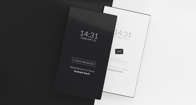
With each new operating system release, consumers are given more and more choices to customize their phones, tablets, and PCs to fit their needs. An increasingly popular option is dark mode. Dark mode gives users the ability to replace the normal dark colors on a light background with light colors on a dark background.
Unfortunately, there are currently no universal standards for how to display dark mode emails and each operating system and email client handles dark mode differently. What can you do? Keeping a few tips in mind when creating your email newsletters can go a long way to making sure your users are getting the best user experience possible, no matter which color scheme they choose.

Transparent Images
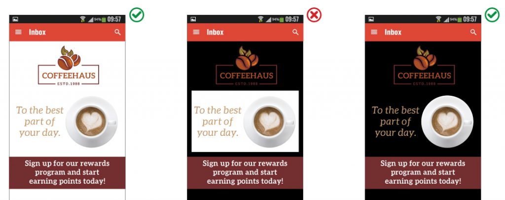
Whenever possible, use images with transparent backgrounds. Images saved with white backgrounds such as jpgs can look out of place when viewed in dark mode. The resulting box surrounding the image can be visually jarring and disrupt the flow of your design. Even worse, it can draw attention away from your email’s key message.

Outline Dark Text and Icons
Dark icons and images of dark text can virtually disappear when viewed in dark mode. By adding white outlines, you can prevent these design elements from hiding in the shadows. As a bonus, the outlines are themselves invisible when viewed on a white background and your design isn’t compromised.

Color Choices
If possible, choose colors that render well on light and dark backgrounds. If that isn’t an option, develop a secondary color palette optimized for dark mode that can be implemented with CSS.
Test! Test! Test!
Since there are currently no universal guidelines for how dark mode is implemented, you’ll need to test your emails to make sure you’re providing the best user experience possible across a broad range of devices.
Services such as Litmus or Email on Acid can be an invaluable resource for seeing how your email displays on a variety of platforms. By implementing a few simple tips and testing rigorously, you’ll be well on your way to creating and sending emails that look great everywhere.
Did you like this blog post?
Get more posts just like this delivered twice a month to your inbox!


