Unless you are familiar with web and technology terms you may not completely understand what responsive design is. With the web’s migration from desktop to mobile, it has never been more crucial to provide an excellent mobile experience.
Website owners have two options when it comes to building a mobile friendly experience for their users. The first option is to have two different websites – your main website that a user would use on a desktop computer and a mobile version of that site with limited graphics, information and an easy to use interface. The second option is creating one website that will detect what device is being used to view the website and automatically reduce images (both size wise and completely removing them in some cases) as well as content.
With option two, you are creating a responsive website experience that delivers the most relevant content depending on the device being used.
Examples of Responsive Websites
Responsive design is very prevalent on the web today; in most cases you may not even realize the site you are visiting is responsive. I have compiled a list of my top five responsive websites. You can reduce the width of your browser window to see the website reduce graphics and content.
Houston Metropolitan Federal Credit Union
First on the list is Houston Met. Federal Credit Union. When you visit the site on your desktop computer you will see the site looks like a normal site. This website is designed using a full background image, not containing the content of the site in a container. You can’t tell the site is responsive until you begin to make the width of the browser window narrower. Then you can see the navigation changes the way it operates, items begin to shift and in some cases are removed.

Homeland Credit Union
Next is Homeland Credit Union, you can see the design of this website is completely different from the last one. The content of the site is contained within the white area using a color background instead of an image. Again the site looks normal on a desktop until you scale the width of the window down. You can see all the elements of the site shift and scale down to accommodate the change in screen real estate. Even the banners are reduced in size so that messaging is not lost.

Garmin
Garmin has created a responsive website that really changes and reduces content to keep the use-ability of the site consistent. The main navigation of the site is displayed by clicking in the upper left hand corner, but to reduce the amount of options and keep the site easy to use they have created icons that mobile users would need most. You can see the footer content is removed as well as most of the other content. The banners are reduced to small images with easy to read text. They have done an excellent job of reducing clutter for mobile devices creating an outstanding user experience for people on the go.

The Paint Drop
Not only is The Paint Drop’s design fantastic it is also responsive. Again making the width of the window narrower you can see the responsiveness in action. Content is shifting and in this case doesn’t appear to reduce the amount of content it, changes the way it is displayed to appear that it is reducing.

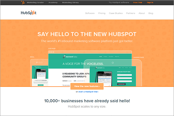
HubSpot
HubSpot uses the classic “Hero” design while still creating a great responsive site. You can easily see the content shift when then window is made narrower. The site is still very easy to navigate for both desktop users and mobile users. There does seem to be a lot of vertical scrolling for mobile users but they do keep the most important messaging at the top.

Is Responsive Design Right for My Business?
With the shift in mobile users this argument really isn’t valid. If you don’t have some type of mobile website, either two websites (a standard and mobile) or one responsive one you are potentially losing ground to companies that are engaging mobile users and creating experiences that make using their product or services easier to use.
Responsive design is not a “trend.” The movement to a mobile first approach has begun and will not slow down. This means that in the near future websites will be designed for a mobile user first and a desktop user secondly. Companies that have a responsive site are far ahead of the curve and preparing for the mobile push.
In Closing…
If you are going to start this year with a website revamp, complete overhaul or creating a new website from scratch you need to strongly consider mobile users. The statistics don’t lie, two-thirds of cell phone owning Americans use their phones to surf the web and check email, that is double the amount from 2009 when only 31% of people said they used their phone to access the internet. 21% of phone users use their device as their primary way of accessing the internet. If you don’t think about mobile users they will migrate to a company that does.
Did you like this blog post?
Get more posts just like this delivered twice a month to your inbox!


