

In branding, your logo is often the first impression people have of your business. It acts as a visual representation of your brand, helping communicate who you are, what you offer, and the qualities you want people to associate with your business.
Before a customer reads your website, visits your storefront, or tries your product, they’ve likely already formed an impression of your brand. Your logo plays a major role in shaping that impression, making it one of the most important elements of your visual identity.
So, What Is a Logo Exactly?
A logo is a visual identity that uses elements such as typography, color, symbols, and imagery to help people recognize and remember a brand. Whether representing a company, organization, product, or individual, a logo serves a purpose far beyond decoration. It helps shape perceptions, communicate values, and create meaningful connections with an audience.
A well-designed logo can convey professionalism, establish credibility, and reflect a brand’s personality, all while helping it stand out in a crowded marketplace. While many people think of logos as simple icons or symbols, they come in several distinct forms, each with its own advantages and challenges.
Some logo styles excel in digital environments, while others are better suited for print applications or maintaining clarity at smaller sizes. Understanding the different types of logos can help businesses choose a visual identity that aligns with their goals and the way they want their brand to be recognized and remembered.
Wordmarks: Letting Your Name Do the Talking
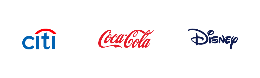
Wordmarks rely entirely on typography, turning a company’s name into its primary visual identifier. Brands such as Citi, Coca-Cola, and Disney have built powerful identities using this approach.
Because the business name is always front and center, wordmarks are highly effective for building name recognition. They work especially well when the company has a short, distinctive name that deserves attention.
The success of a wordmark depends largely on its typography. Without strong lettering and thoughtful design, a wordmark can struggle to stand out. It can also lose clarity when reduced to very small sizes, such as mobile icons or social media profile images.

Lettermarks: Simplifying Long Names
Some organizations have names that are too long to display effectively in a logo. Lettermarks solve this challenge by using initials instead of the full company name.
Companies such as GEICO, NASA, and IBM demonstrate how a simple set of letters can become a recognizable brand asset. Lettermarks create a clean, professional appearance while making logos easier to reproduce across different formats.
Their biggest limitation is that initials rarely explain who the company is. Newer businesses may need additional marketing efforts before customers associate the abbreviated logo with the full brand.
Combination Marks: The Best of Both Worlds
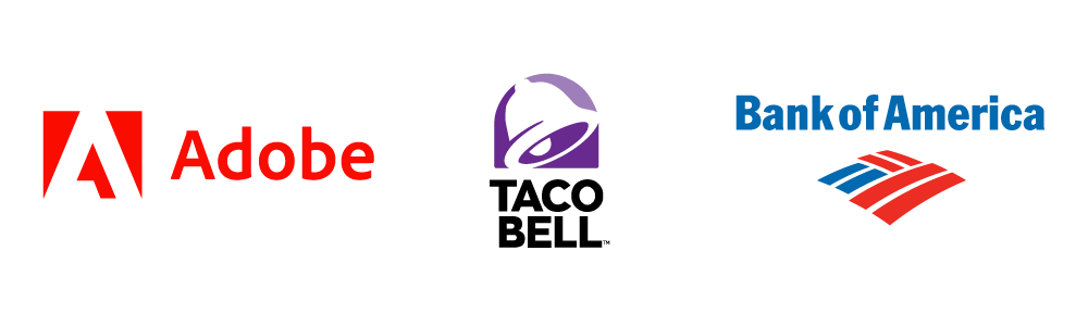
Combination marks bring together a visual symbol and a company name within a single logo system. This approach is used by brands such as Taco Bell, Adobe, and Bank of America.
For many organizations, combination marks offer an ideal balance. The symbol helps build visual recognition while the name reinforces brand awareness. Over time, the icon may even become recognizable enough to stand on its own.
The key challenge is creating harmony between the graphic element and the typography. When designed poorly, one element can compete with the other instead of supporting it.

Pictorial Marks: Recognition Through Imagery
Pictorial marks use a recognizable image in place of text. Examples include Apple’s apple, Target’s bullseye, and Shell’s iconic shell.
When a pictorial mark becomes established, it can instantly trigger brand recognition without a single word. This simplicity makes the style highly versatile across languages, regions, and marketing channels.
The challenge is that symbols have no built-in context. A standalone image usually requires years of consistent exposure before customers automatically connect it to a specific brand.
Abstract Marks: Creating a Unique Visual Signature
Unlike pictorial marks, abstract logos aren’t designed to represent a recognizable object. Instead, they use shapes, lines, and geometric forms to create a distinctive visual identity.
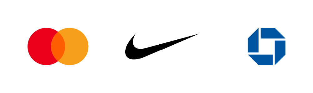
Brands such as Nike, Mastercard, and Chase have used abstract marks to create unique visual identities that are recognizable around the world. Because these designs aren’t tied to a literal image, they provide greater creative freedom and can communicate energy, movement, innovation, or emotion.
At the same time, abstract marks require strong brand consistency. Since their meaning isn’t immediately obvious, the logo gains significance through repeated exposure and positive customer experiences.

Mascot Logos: Putting a Face to the Brand
Mascot logos use illustrated characters to represent a company. From Colonel Sanders to the Michelin Man, these personalities often become as recognizable as the brands themselves.
Mascots can make a business feel approachable, memorable, and relatable. They are particularly effective for brands that want to create a friendly, welcoming image or appeal to families and younger audiences.
However, detailed illustrations can lose effectiveness at small sizes, and the playful nature of mascots may not align with every industry or brand personality.
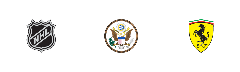
Emblems: Tradition, Heritage, and Authority
Emblem logos place text within a badge, seal, shield, or other enclosed shape. They are commonly used by universities, government agencies, sports organizations, and heritage brands.
This style naturally communicates tradition, trust, and authority. The structured design often conveys a sense of permanence and credibility that resonates with certain audiences.
Because emblems typically contain more detail than other logo styles, they can be less flexible across modern digital applications and small-scale formats.
Which Logo Type Is Best?
There is no one-size-fits-all solution when it comes to logo design. The right choice depends on your brand’s personality, audience, and long-term goals. Whether you choose a wordmark, emblem, mascot, or combination mark, the most effective logos are those that clearly communicate who you are and what sets you apart. A great logo creates a strong first impression, reinforces your brand identity, and helps customers recognize and remember you over time.
Closing Thought
For banks and credit unions, a logo is more than a design element. It serves as a visual reflection of your institution’s values, reputation, and commitment to the people you serve. Whether displayed on a branch sign, debit card, mobile app, or website, your logo helps shape the way members and prospective customers perceive your brand.
As member expectations continue to evolve and digital experiences become increasingly important, it’s worth evaluating whether your current logo still reflects your organization’s identity and future direction. A successful logo should feel relevant, recognizable, and aligned with the trust and professionalism your institution works hard to build. If your visual identity no longer communicates those qualities as effectively as it once did, a thoughtful refresh may be an opportunity to strengthen your brand and ensure it continues to resonate with the audiences you serve.
LKCS is not affiliated nor endorsed by the companies and organizations in this post.
Did you like this blog post?
Get more posts just like this delivered twice a month to your inbox!