We’ve updated the layout of our Social Media Management Tool dashboard to make it more intuitive. This is a significant step in our journey to continually modernize and improve our platform’s user experience.
What’s New?
- Make it easier to focus on specific tasks at a time, like scheduling content or monitoring community engagement.
- Allow new users/staff members to hit the ground running even faster.
- Help our clients find even more value from robust features that they might have missed.
Updates
New Landing Page
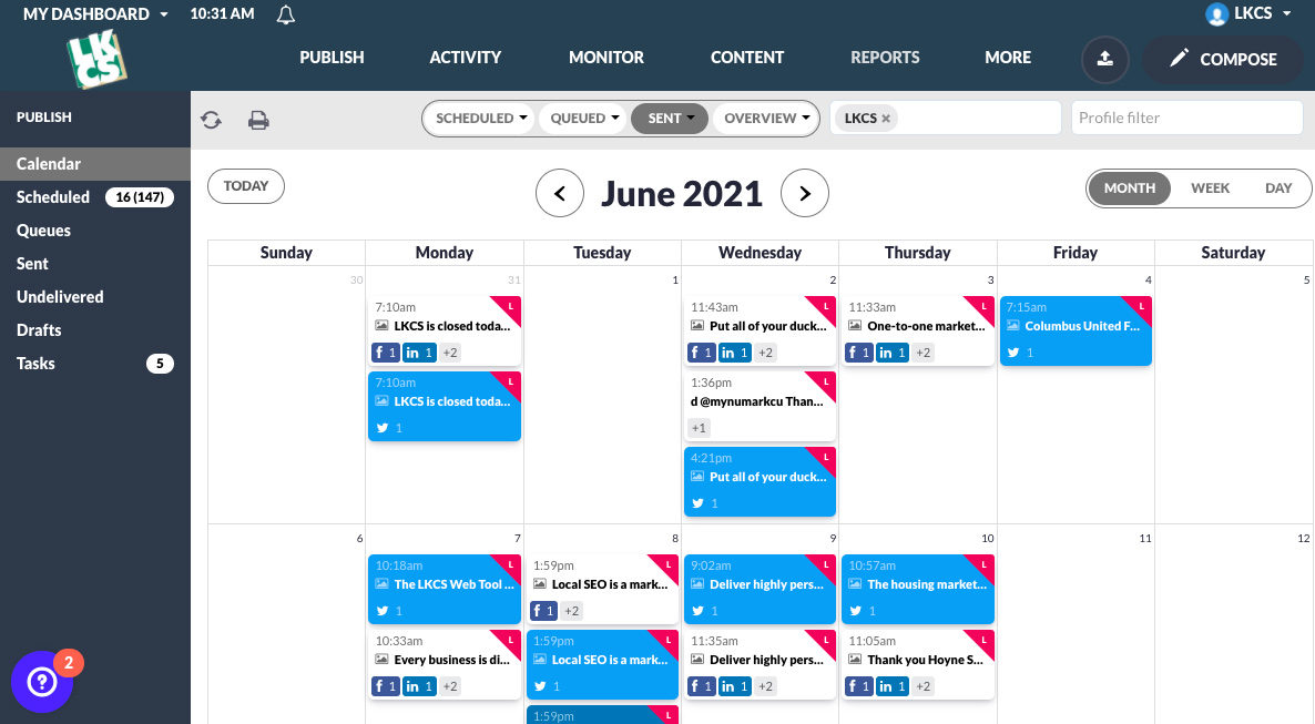
Each time you log in, you’ll land on the Calendar view, so you can see upcoming posts and what has already been posted.
Publish
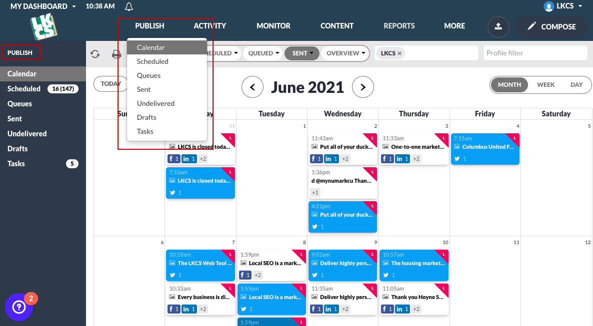
All of our publishing features, including the calendar, queues, undelivered messages (previously known as ‘bounced posts’), tasks, and drafts now have their own distinct section separate from incoming comments, replies, and DMs.
Activity
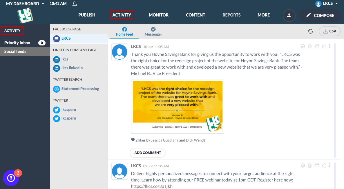
Community management and audience engagement features like the Priority Inbox and social feeds (previously known as ‘Streams’) now have their own distinct navigation section.
My Tasks
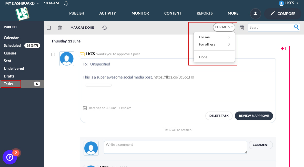
Tasks assigned to others, yourself, or that are already done have now been consolidated into a single view where you can toggle between the three options.
Reports
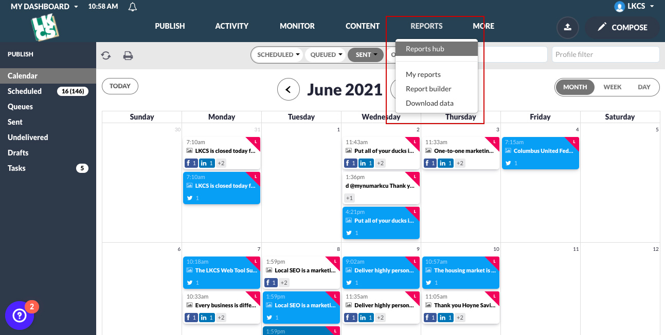
Reports are now clearly marked in the dashboard, making it much easier to navigate to and explore for new users.
RSS Feeds
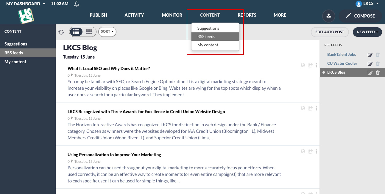
Previously, RSS feeds were just ambiguously named “feeds”, so we’ve fixed this potential point of confusion.
Questions?
Do you have questions about the new updates or would like to schedule a demo? Please contact your account sales representative for more information!
Did you like this blog post?
Get more posts just like this delivered twice a month to your inbox!


