Website design trends come and go year after year. Some trends stick around for a while and become an everyday web design style, while some fade faster than a cheap plastic slide in the summer sun. You may have already heard the term parallax scrolling, a new trend that is evolving daily. The use of parallax scrolling is a couple years old, but did not become main-stream until recently.
Parallax scrolling goes against the norm of minimal scrolling. Most businesses want to eliminate scrolling from their website as much as possible. Parallax scrolling does just the opposite, and takes it too extreme in some cases. You can still click to move around on the page to get directly to the content you are looking for or you can scroll to the section you are looking for. Parallax scrolling is like taking the scenic route on summer vacation. You can click (fly) to get there or you can enjoy yourself and see all the visuals the website has to offer.
Examples of Parallax Scrolling Websites
Since parallax scrolling has become more main-stream some brands have put together some outstanding websites taking you on a journey and telling a story along the way. Here are a few of my personal favorite examples:
Nike’s Jumpman Website
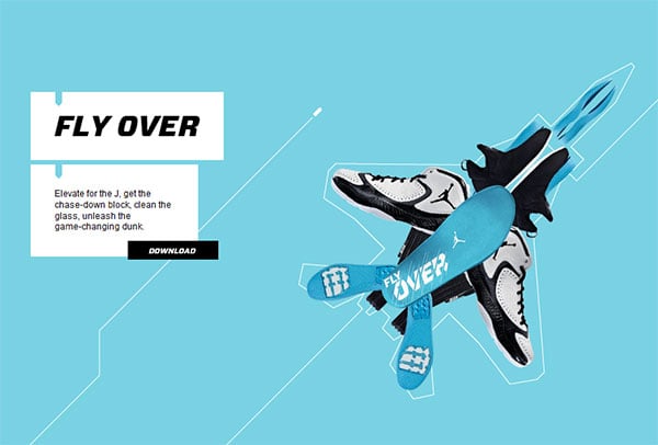
The first example that comes to mind is Nike’s Air Jordan website. This site tells the story of each shoe and shows how it’s made. Comparing the shoes to cars, tanks, and fighter jets the graphics are clean and the site flows together smoothly never leaving you wondering what’s next. The site also uses non-traditional navigation on the right hand side of the page. This lets users get the content they are looking for or they can scroll and enjoy the website.

Nintendo’s Mario Kart Website
The next site is Nintendo’s Mario Kart website. This site acts as a timeline of the evolution of Mario Kart. You can watch videos, see favorite memories of past game releases, and even see old familiar characters. The graphics all work together to keep users interested while leading them to the next portion of the site. Nintendo also uses a non-traditional navigation at the bottom of the window, which allows users to jump to certain points on the timeline, but why rush through the site, there is so much to see?

Alzheimer’s Research UK Website
The last example is Dementia Lab by the Alzheimer’s Research UK group. The intro to this website is pretty cool and helps users to understand how big a problem Alzheimer’s is. This site uses the parallax effect slightly different – taking you around the lab and showing the different areas of research as well as how all the machines work. The website also features a non-traditional navigation scheme. It is on the left but it’s very minimalistic and doesn’t take away from the parallax scrolling.

Is a Parallax Scrolling Website Right for My Business?
After seeing these examples you might be thinking, that looks fantastic I want my website to do that. However, a parallax scrolling website is not a solution for every company. If you have a website with a lot of pages (over 10) this probably isn’t the best option for you. Additionally, if your company isn’t one to push the design envelope, is convinced parallax scrolling is a trend that will soon fade, or reaches a demographic that may find parallax scrolling either difficult or annoying, you may also want to avoid this new trend.
However, if you want your company’s website to stand out from the crowd in your industry, being one of the first to use parallax scrolling may show your clients you’re keeping up with today’s web trends. Parallax scrolling lets people enjoy a website more and interact with it more. This will get people using your website more often and for longer periods of time.
In Closing…
I believe that parallax scrolling is here to stay. It may not gain the notoriety that responsive design has in the last year and half, but I believe parallax scrolling will always be around in some form. It makes the navigation of a site and the ability to tell a story without clicking a mouse, easy. Creating a website that is easy to use should be every web designer’s main goal… parallax scrolling helps to accomplish this.
Did you like this blog post?
Get more posts just like this delivered twice a month to your inbox!


