

A few weeks back, I revealed the typefaces that LKCS’ designers were using that had become their favorite go-to for legibility and flexibility in both web and print work. Well, it’s only fair then, that they also single out some that make them cringe.
While some of these choices may be sound typographic options, some fonts just don’t stand a chance when these designers are hard at work.
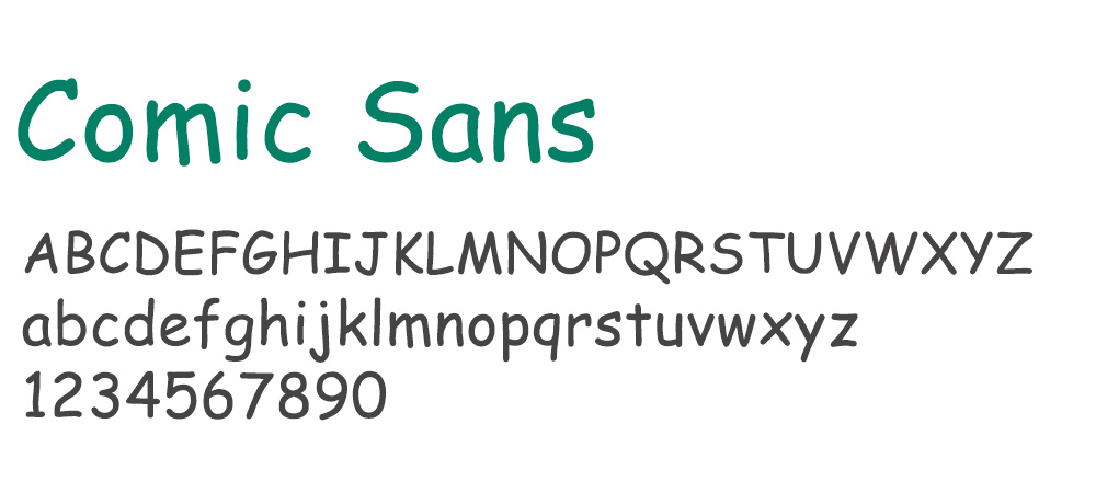
The obvious choice, according to Angie and Ryan. Unless you’re working on a comic strip or mimicking children’s writing, most designers stay clear of Comic Sans.
James says:
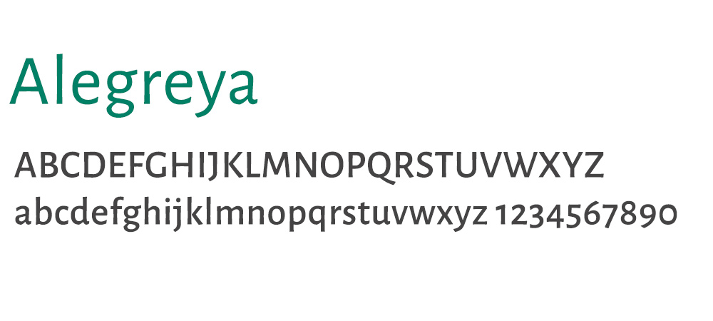
Any typeface that the numbers have different baselines. I’ve never seen a situation where a font like that was used and it looked good.
Janet says:
The sample shown is the typeface Alegreya. Remember, in my last post I said I liked using this typeface but I always have to change the numbers to proportional alignment? Well, that’s because like James, one of my biggest pet peeves is a typeface whose numbers drop below the normal baseline.
Runner Up:
Jessica says:
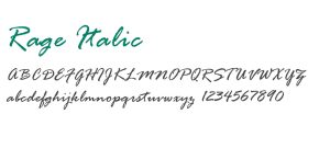
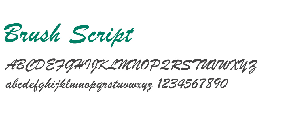
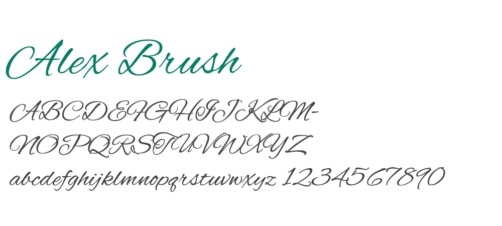
Rage Italic is like if Papyrus (read on how terrible it is) teamed up with Brush Script (mediocre). It’s either used to look like something that was handwritten (it doesn’t) or in logos which often look dated. The name fits however because it does induce a lot of rage!
Runners Up:
Karen says:
Hard to say that I hate a typeface, but I’m not a fan of any of the older script typefaces.
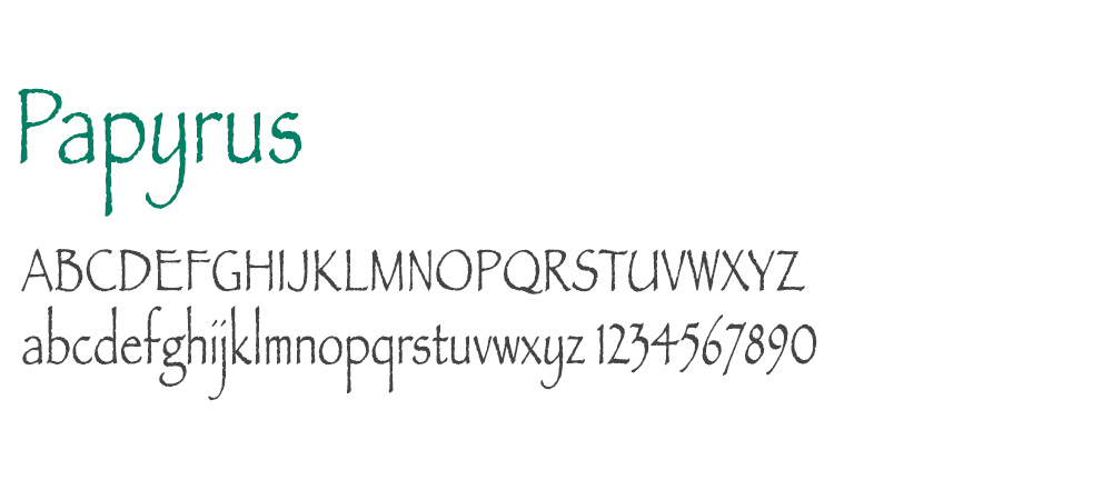
Ryan says:
The obvious come to mind: Comic Sans and Papyrus. Between the two, I probably dislike Papyrus more, just because it is used in logos so often. I think it’s too bad that it is so widely used, because a logo should be one of the most important pieces of marketing that instantly identifies your business.
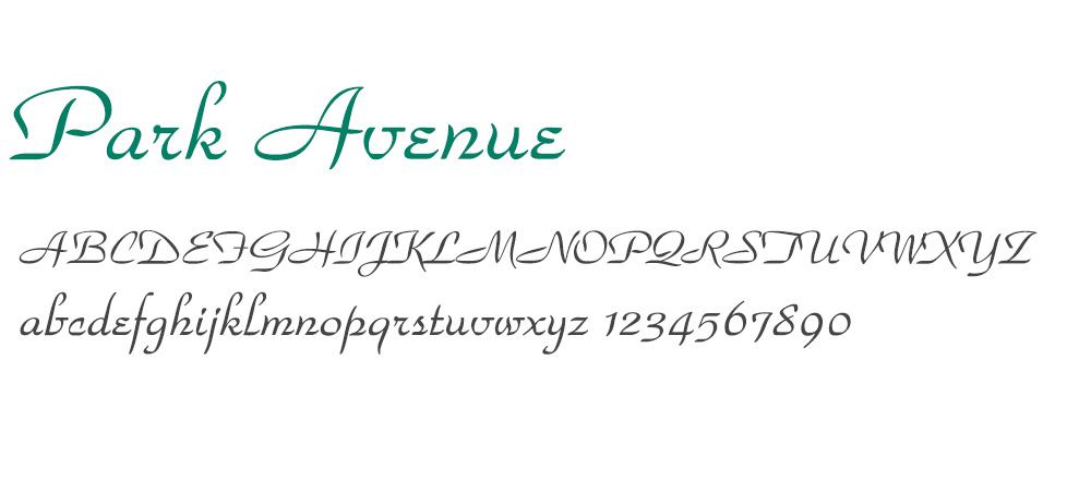
Janet says:
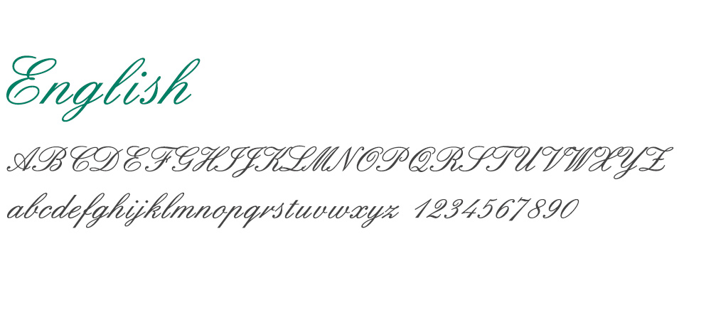
I see this typeface used in formal announcements, such as wedding invitations. I view Park Avenue as a dated calligraphic script font. ¬Although I could list several more typefaces that are similar in look and feel (refer to English that Karen mentions), I tend to see this one used more often.
I would suggest updating special occasion pieces with some of the newer, script or cursive typefaces for more visual appeal. Allura, for example, has been around for a while but its letterforms look more modern and have nice movement.
Were any of the typefaces mentioned ones you actually prefer to use?
Everyone has their own likes and dislikes. Obviously, the LKCS designers flagged a lot of script or calligraphic-inspired fonts. We didn’t intend to pick on this style specifically, and hope you don’t hold it against us if you like any that we mentioned. Perhaps you can show some examples of work you’ve done that incorporates any we singled out – maybe you can convince us we were wrong about them! Otherwise, feel free to add the typefaces you believe are overused or overrated (in other words, they’re not your favorite) in the comments below.
Did you like this blog post?
Get more posts just like this delivered twice a month to your inbox!
