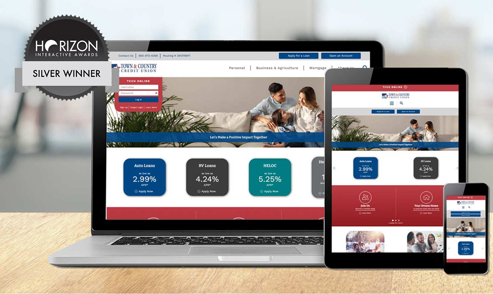
LKCS is the recipient of two Horizon Interactive Awards for website design. Selected as winners were Santa Fe Federal Credit Union and Town & Country Credit Union (of North Dakota).
Every year, Horizon Interactive Awards receives thousands of entries from all over the world. A panel of industry expert volunteers review entrants and determine the winners based on:
- UX/Design
- Creativity
- Technical
- Message
- Effectiveness
For LKCS’ work, the judges awarded two Silver Level awards.

SantaFe Federal Credit Union
The goal for SantaFe’s website design was to create a clean design that presents key products and message distinctly while remaining visually interesting. To incorporate the credit union’s branding, lead designer, Karen Riva, utilized railroad imagery and aspects from the logo symbol. These were used to highlight quick links, text bullets, and as a background image. A unique feature is the interactive historical timeline, which was programmed by Grace Kennell. Visitors to the page can click on each decade to reveal milestones through the years. Each milestone can be expanded to reveal more content, which helps keep the page clean and simple to follow.

Town and Country Credit Union
Lead designer Tom Quesse’s goal for this credit union website design was to modernize the style while maintaining a sense of familiarity for their members. The website presents a simple navigation with a clear view of content they’d like to have stand out. Space was added to feature their community and membership involvement as well.
Congratulations to the entire team behind each website. We’re proud of our designers and the team that brings each bank or credit union website design to life!
Did you like this blog post?
Get more posts just like this delivered twice a month to your inbox!


