

DataFlex is a great source of detailed data on members, balances, averages, and other numbers, but sometimes a higher-level view of trends is needed for a presentation, or a visual display of data can be a better way to understand the data and underlying trends. There are two main ways of visually displaying data that I’d like to cover. They are: visualizations and graphs.
Visualizations
First, I’d like to talk about visualizations as they are interactive and more interesting to play with. Below I’ve included an example using a bubble chart. You can drag and drop attributes and metrics onto the vertical and horizontal axes and experiment with color-by, size-by, and break-by points as well. As always, formatting options exist for controlling thresholds. Dragging and dropping allows for quick on-the-fly adjustments and exploration of the data.
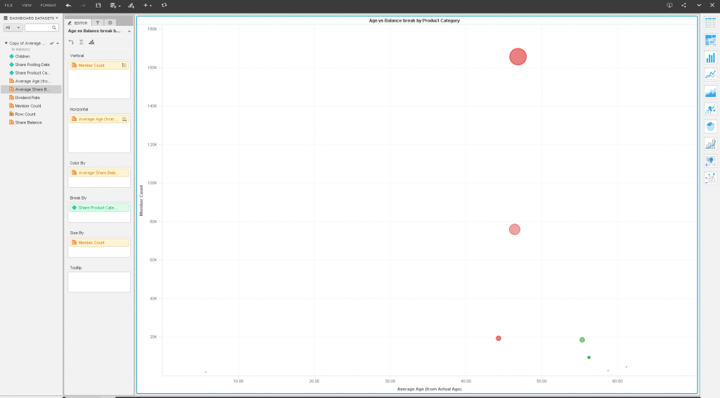
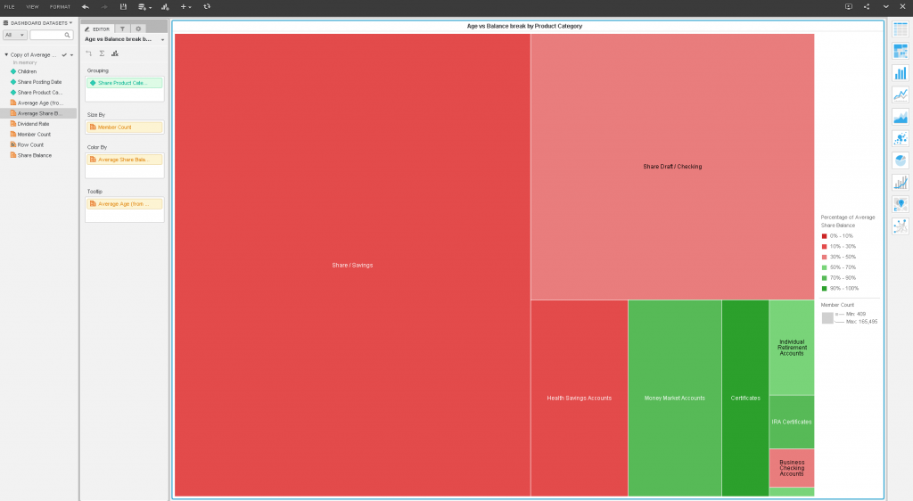
On the right-hand size is an easily accessible toolbar offering the ability to switch visualization types at the click of a button. With one click, the above bubble chart is transformed into the below heat map:
What could be easier and faster?
Graphs
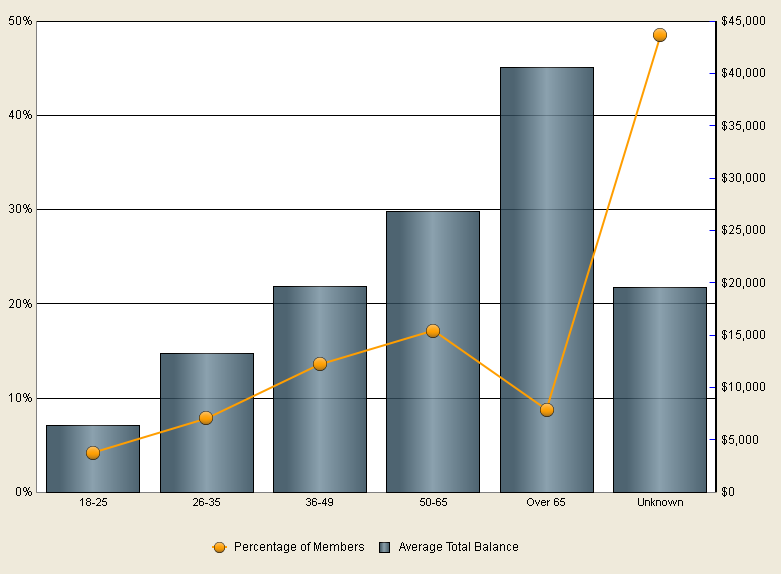
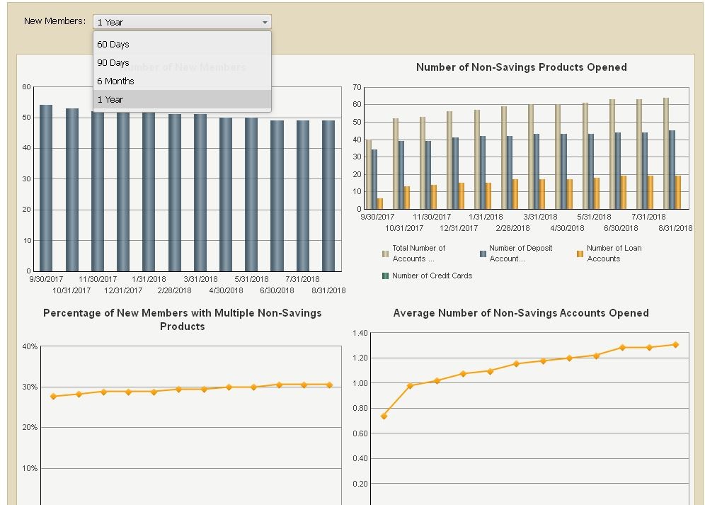
Another way to perform data visualization in DataFlex is through graphs. The classic bar chart and line charts are available and are common in DataFlex for good reason – they are simple and straightforward and can be used to visually present nearly any type of data.
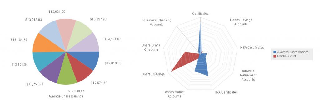
However, DataFlex has many other types of graphs available including funnel charts, bubble charts, Pareto charts, Gantt charts, and of course the pie chart and radar chart:
Like most charting software, DataFlex charts can be formatted with various fonts, colors, legends, dual-axis layouts, stacked lines and bars, and three-dimensional bars and area charts. DataFlex, however, leverages its prompting and filtering abilities to change what is displayed on the fly. Want to look at a chart breaking down products within various product categories and flip back and forth between multiple categories? DataFlex can do that. Or look at various time frames? DataFlex can do that too!
Contact us today to find out more about DataFlex
The graphing and visualization capabilities I covered make DataFlex more powerful and easier to use than ever. Using the various graph and visualization options with the right metrics and attributes can lead to visually arresting and informative charts. Contact LKCS today to learn more about DataFlex and what it can do for you.
Did you like this blog post?
Get more posts just like this delivered twice a month to your inbox!
