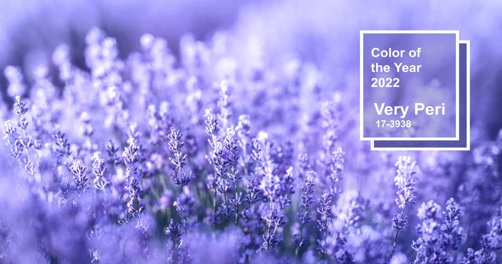
For over 22 years, Pantone Color experts release a “Color of the Year” as a means to predict designs trends for the coming year. This year, Pantone has announced PANTONE 17-3938 Very Peri as the 2022 Color of the Year!

Pantone shared why they chose this as their color of the year:
“As we move into a world of unprecedented change, the selection of PANTONE 17-3938 Very Peri brings a novel perspective and vision of the trusted and beloved blue color family, encompassing the qualities of the blues, yet at the same time with its violet red undertone, PANTONE 17-3938 Very Peri displays a spritely, joyous attitude and dynamic presence that encourages courageous creativity and imaginative expressions.”
– Leatrice Eiseman, Executive Director of the Pantone Color Institute
What 2022’s Pantone Color Means for Financial Institutions
Understanding the psychology of these colors can subtly influence your audience’s perception of you and the campaign you are promoting. Blue delivers a sense of tradition and calmness which can influence your account holders to trust that their financial decisions are in good hands.
Find Inspiration All Around
Shades of perwinkle, like Very Peri, have been all around us in design, fashion, architecture and even nature. Pay close attention and you might find it in unexpected ways that inspires you for your next project.
.@Pantone has released its 2022 color of the year: Veri Peri. Take a look at these iconic Carnegie Hall posters that feature the color, courtesy of the #CHRoseArchives. Explore our full Digital Collections, which includes images, archival items, and more: https://t.co/8Xa75B5fxT pic.twitter.com/uVCFOON401
— Carnegie Hall (@carnegiehall) January 19, 2022
Check out @JonBatiste & Stay Human rocking the official @pantone color of the year, “Very Peri.” We love a band that keeps up with the latest fashion! 😍 pic.twitter.com/8Ef93x56Lx
— The Late Show (@colbertlateshow) January 13, 2022
To find Pantone’s Color of the Year, just look to the natural world. https://t.co/9B3EljPOCO pic.twitter.com/tPzeoqIxdr
— Condé Nast Traveler (@CNTraveler) January 23, 2022
B&A pays homage to the right side of our brains, as we celebrate @pantone's Color of the Year: Very Peri. Find inspiration from the hue in our portfolio below. #BuildingWithBA #Pantone #PantoneColorOfTheYear pic.twitter.com/13qmVVCS0F
— Bulley & Andrews (@BulleyAndrews) January 20, 2022
Design with the New Trend
The LKCS DS team is ready to incorporate PANTONE 17-3938 Very Peri into your next campaign! Contact LKCS to get started!
LKCS is not affiliated with the tweets/accounts mentioned in this post.
Did you like this blog post?
Get more posts just like this delivered twice a month to your inbox!


