Creating banners for the web can seem difficult sometimes, but really it’s only as difficult as you make it! The fact is that with the right thought process and attitude you can make yourself a simple and elegant banner without much trouble. To make the process easier, I’ve written up five quick tips that I think about when I create web banners.
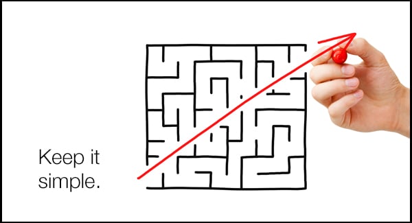
1. Keep it Simple
There’s no need to make a banner too complex! Just make sure that it gets your idea or pitch across to the viewer in a simple way. Most of the time your banner is going to lead the viewer to a landing page containing more detailed information. This means you’re going to want your banner to simply state the most important points you want to get across. So keep it simple and focus your message!
2. Use Visual Hierarchy
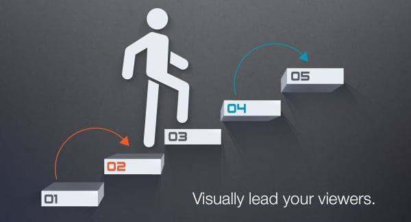
When thinking about any design, visual hierarchy is a very important concept. Visual hierarchy is the order in which the human eye perceives what it sees. This order is created by the visual contrast between forms in a field of perception. Objects with highest contrast to their surroundings are recognized first by the human mind. Basically, it means you need to sort out what information is most important in your banner and place these elements in a way that visually leads the viewer through your message. My fellow designer Ryan talks more about visual hierarchy in the previous blog post. Go check it out if you would like to learn more!
3. File Optimization
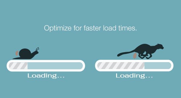
Optimizing the image is also a very important step. You don’t want your banner to slow down the loading time of the page it’s on. Slow load times are frustrating for viewers and this is something that can be easily avoided. When saving for web, make sure the quality settings are low enough that your picture won’t bog down the load time. The trick is to find a sweet spot where the quality settings don’t degrade your image but keep the file to a reasonable size.
4. Don’t Underestimate Negative Space
One of the biggest mistakes that people make when creating their concept for a web banner is thinking “The banner is so small on the page. I’m going to need to make everything big so that people will notice it.” This is actually the opposite of the truth! When you make everything large on a banner and cram it into that space it does several bad things:
- It can actually make the banner less impactful.
- You usually lose visual hierarchy – If everything is huge, then nothing will stand out without an amazing use of other forms of contrast.
- You tend to lose readability – Your banner will most likely become badly organized and very hard for your viewers to read and understand.

5. Mind Your Surroundings
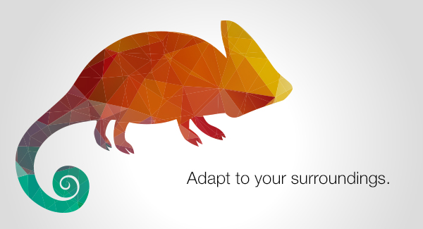
Where your banner is going to be placed can be very important to how you design your banner to look. By being aware of the page that surrounds the banner, you can make much better decisions when designing. You want your banner to be a good compliment to the website as a whole. It is important to find ways for your banner to stand out from the page, but not clash with the overall design. Implementing your banner into the page correctly will make your banner much more effective and attractive.
I hope these tips help you out when trying to create your own banners. Some of these, like visual hierarchy and use of negative space, are universal design truths which can be applied in many other situations. Try to apply these tips and I bet you will see improvement in your design!
Did you like this blog post?
Get more posts just like this delivered twice a month to your inbox!


