One of the most important ways of communicating content is to have strong typographic hierarchy. What do I mean by that? Typographic hierarchy is a system for organizing content with a clear order of importance. This system of organizing and formatting your type helps the reader to know where to look, and how to easily find what is most important. To begin, the designer needs to make decisions about the elements of their design such as type size, type style, case, color, and spacing, to name just a few.
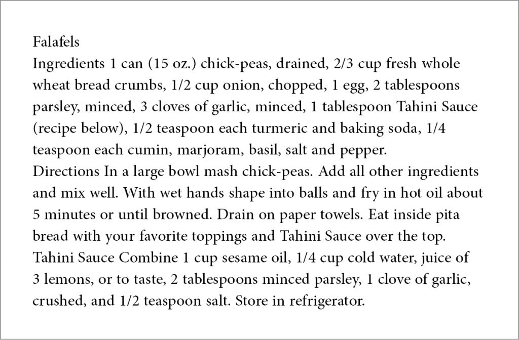
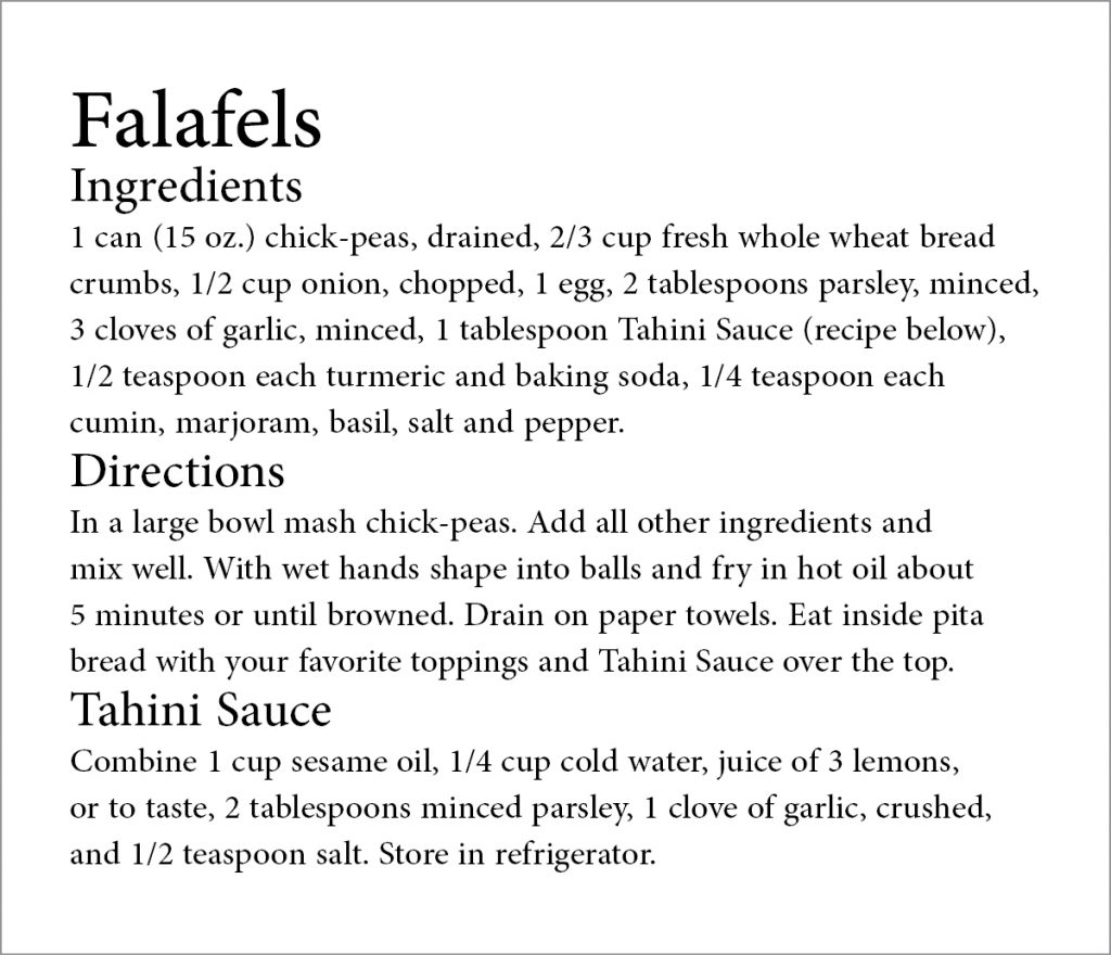
The easiest way to explain typographic hierarchy is to show you some examples of content with and without it. I’ve decided to show you a recipe, since I am obsessed with all things related to food and cooking and read recipes every single day. Here’s one of my favorites, my mom’s falafel recipe.
TYPE SIZE
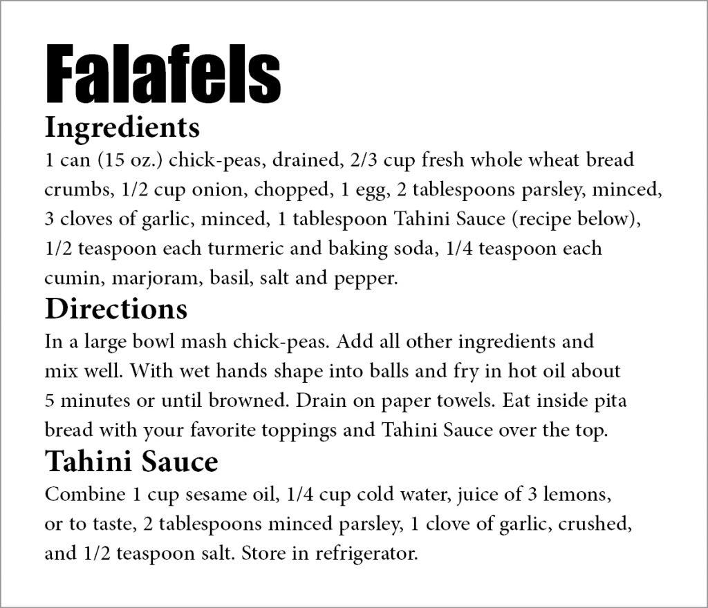
Changing the type size of the text is the easiest and most common way to establish hierarchy. The reader’s eye is normally drawn to the largest type first, which is usually (but not always) the headline. Headlines usually appear at the top of the content establishing the starting point for the reader. Because we read from left to right, and top to bottom, this format is the most natural for readers to navigate. The flow of a well-designed piece should take the reader to the headline, then navigate them through all the other important elements. After the headline, the second largest content is usually subheads, which will also help break up the content to help the reader identify the main points. This is a very common layout that you’ll see in everything from brochures and newsletters to website pages.
TYPE STYLE
The typeface and weight of the font chosen helps establish hierarchy, especially for headlines and subheads. Normally, bold, unique or decorative type styles command the attention of the eye. Simply using a bolder weight of a font can help bring attention to it. When choosing typefaces, combining a sans-serif headline with a serif typeface for body text is a classic rule-of-thumb for information that is easy to read.
CASE
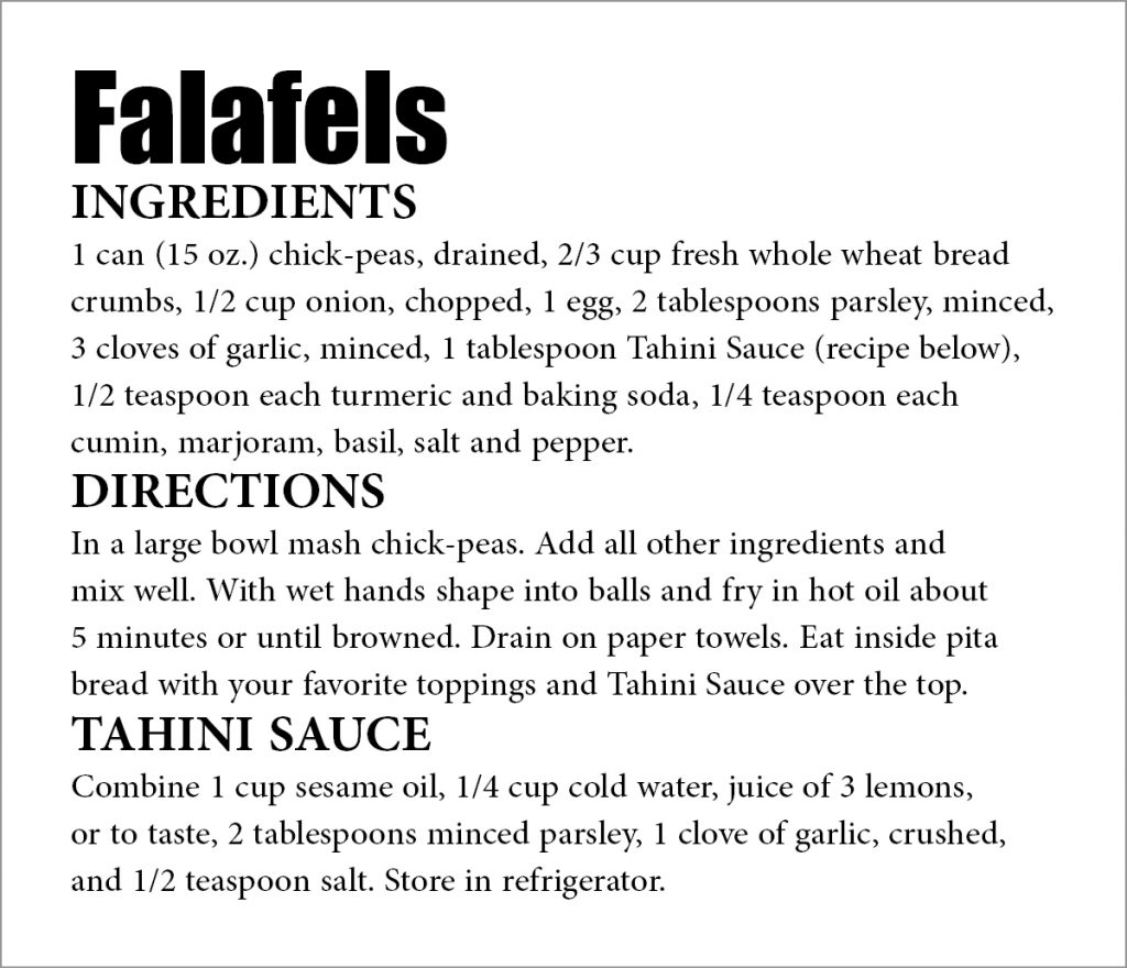
Using all caps (upper case) to emphasize content can be an effective way to draw attention, particularly for headings or subheads. But it also reduces readability, so it should be used sparingly, and not at all with hard to read script fonts.
COLOR
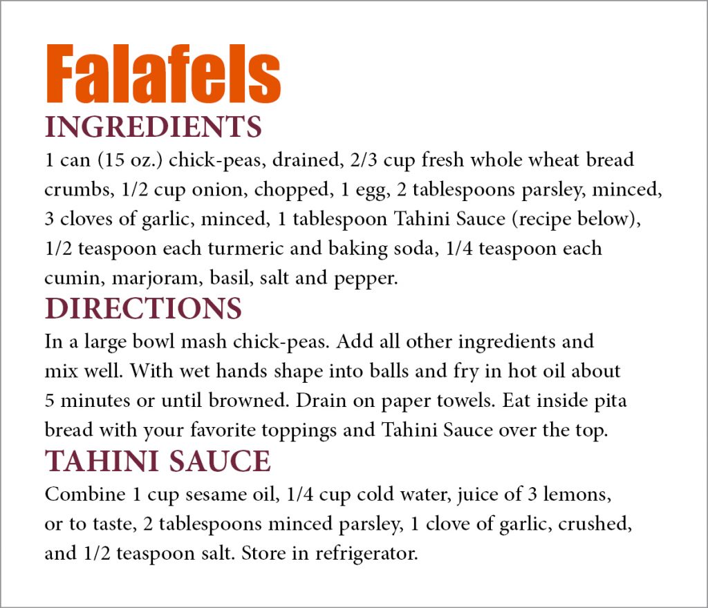
The use of color draws attention to or away from any element the designer chooses. For example, the color orange will instantly stand out on a page with mostly black text. The dominant orange color plays a role in what our eyes see first, forcing the rest of the content to become secondary.
SPACING
The space between and around every element of a design helps organize content and provide visual breaks for readers. Typographic spacing can be used to establish hierarchy; it can also make the difference between a balanced, easily readable design and one that looks cluttered and confusing. The general rule is that related items should appear closer to each other than items that are not related. In my example below, the list of ingredients appear closer together so the reader knows that they are connected. Keeping the more important elements separate gives them prominence.
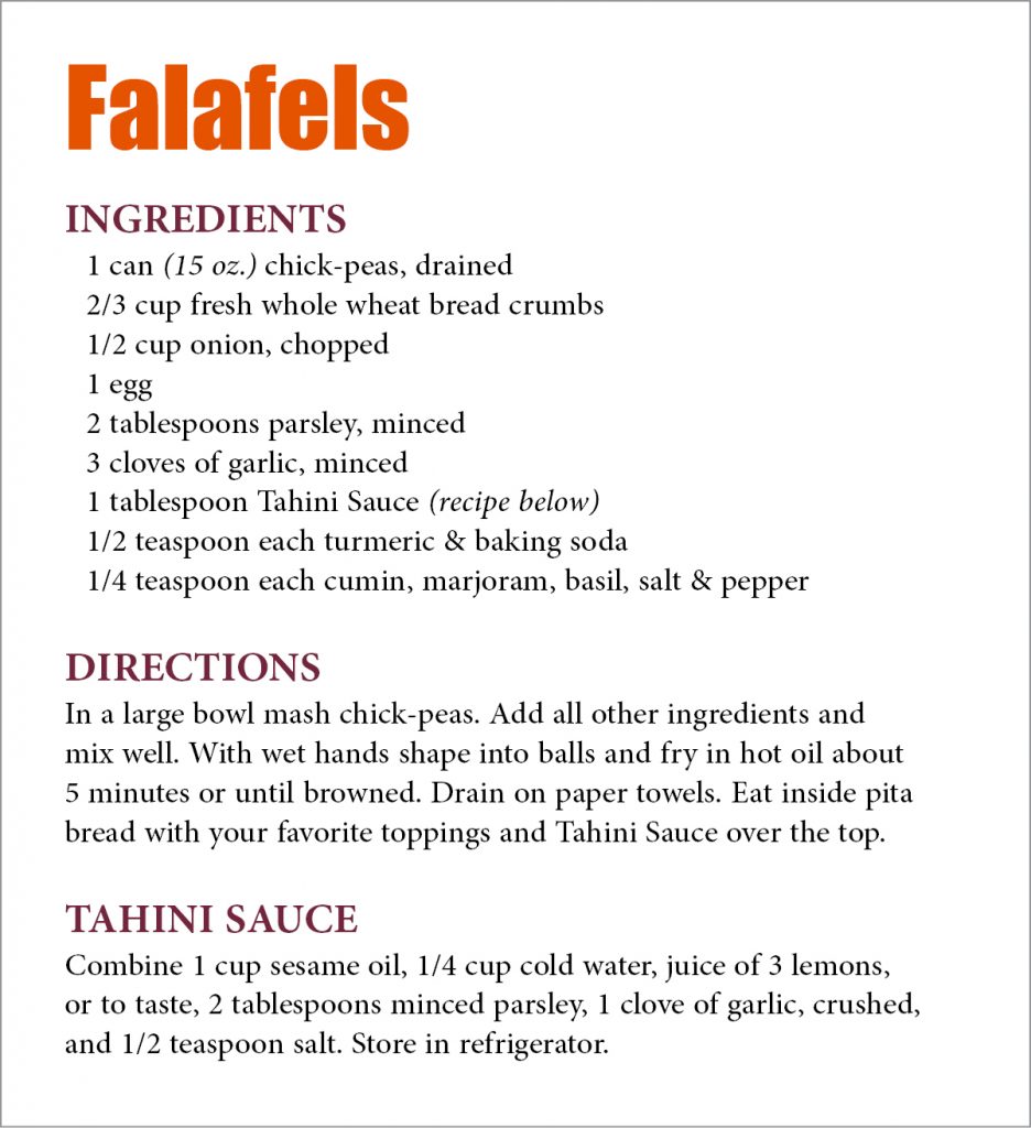
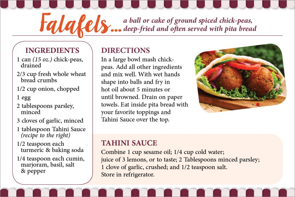
The goal is always to design content in an organized way so the message is read and easily understood. Strong and concise typographic hierarchy is a great way to start. From there, it’s up to you to decide if you want to enhance and organize content with blocks of color, rule lines, a decorative type style or even photos/artwork, like I did below.
To close, try my mom’s recipe for falafels, they’re yummy!
Did you like this blog post?
Get more posts just like this delivered twice a month to your inbox!


