

So you need to design a poster for an upcoming event or promotion your business is ready to market. You are sitting down at the computer and thinking “now what?”, or “where do I start?” That’s where I come in! Creating a successful poster design is easy if you follow a few simple design principles.
First, determine the visual hierarchy. That is a basically a fancy phrase for determining the order for which details are most important to least important for the viewer to read. This does not mean the order of information listed from top to bottom, but rather the information that is seen first. The purpose of your poster is to inform the reader of your event, and the get them to participate. The most important information is usually the largest since people’s attention is typically drawn to the largest element on the poster. This could be the event you are hosting, or the special promotion your company is holding.
Poster visual hierarchy sample:
- Event
- Company
- Date/Time
- Location
- Website or contact information for more details
Posters are a quick read so make sure to grab the reader’s attention. This is where design can be intimidating. Think about things like color, contrast, and scale. We have already determined that the event should be the main focus so make sure it really stands out by using a large font size. Use appropriate fonts (see my earlier post regarding fonts), but not more than 3. More than 3 can get visually distracting.
Choose a strong graphic to make your poster more appealing. A strong visual does not need to be design heavy. It can be simple yet bold. Take a look at this poster for a local jazz festival. The single image of piano keys draws interest and does not distract the viewer from reading the message.
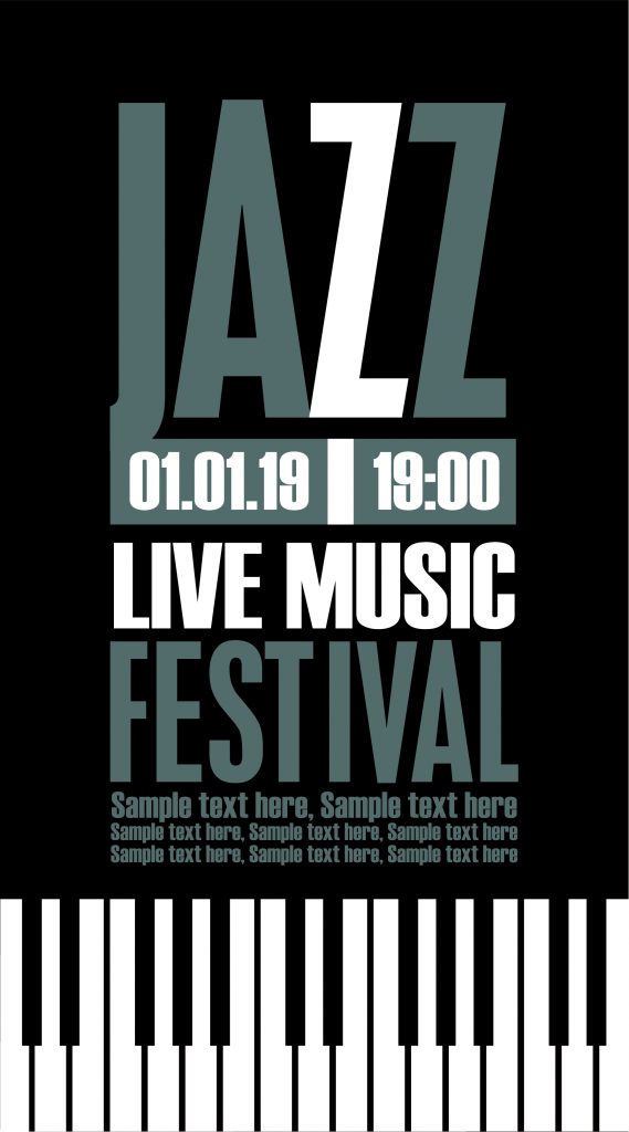
Did you happen to notice in this example poster that the only color used is black? A successful poster design does not need to use a lot of color! This is great news for those who are on a budget, or if you are looking for a simplistic approach to your design. If your budget allows for color, pay attention to how you put colors together. It can be hard to read blue text on a red background. Colors like red and green can give a holiday feel which may or may not be your intent.

Following these principles ensures that you can create a poster that looks great and grabs your reader’s attention. Happy designing!
Did you like this blog post?
Get more posts just like this delivered twice a month to your inbox!
