

Software never stands still. Recently we upgraded our DataFlex platform, significantly altering the look and feel of the application. Along with the appearance, the speed and efficiency has also been improved. I would like to take some time to share some of the exciting new features with you.
New Layout
The layout has been significantly updated to a sleek, modern look with improved navigation. When you first log in, you’ll notice a larger navigation toolbar along the top of the page, and an always accessible shortcut bar along the left side. Featured prominently is a large “New Dashboard” button ready for you to get started on creating an analysis of your data.
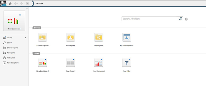
When you click on the DataFlex logo you can access a drop-down menu that allows you to instantly jump back to the home screen, quickly switch to another folder or create some new analysis, or easily log out.
Search Engine
Perhaps the best navigation tool you now have is a search engine. Just like the search engines you use on the Web such as Google, Bing, Yahoo; you can type keywords into the text box and retrieve a list of reports, dashboards, filters, and metrics – anything at all related to what you are looking for.
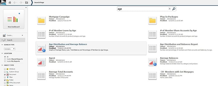
When you use the search feature, a new set of filters appears along the left-hand side of the screen to help you narrow down your search.
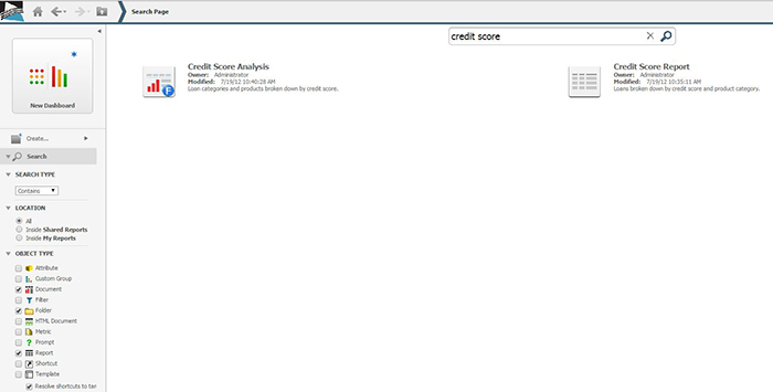
Having trouble remembering what you named that Credit Score dashboard or in which folder it was saved? The search feature is there, ready to help!
Visualizations
The updated DataFlex application makes available a wide variety of exciting new graphical analyses called visualizations. One such visualization displayed below is the network visualization showing the loan product relationships using size and thicknesses of lines and circles.
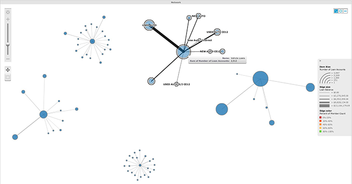
This particular graph displays the loan products of a client’s millennial demographic, and each separate cluster represents a product category. Here, we can see at a glance the two largest loan categories to the right, and hovering over the network in the upper right, we learn it is the Vehicle Loans category and digging further it becomes evident just which products have the largest balances.
Looking at the other networks, it is very easy to see at a glance there are some products that stand out either for holding the lion’s share of the loan value or for having a miniscule portion of the loans. Should we capitalize on a product’s popularity and produce some new marketing for it? For the underperforming loan products, do they need to be restructured and marketed more, or eliminated entirely?
Filters
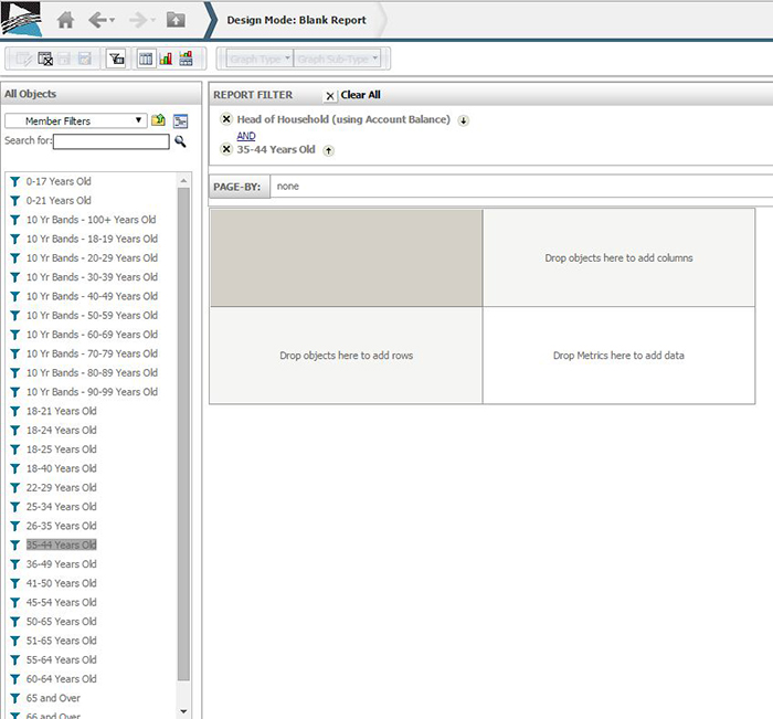
We have added the ability for you to create and save your own filters that you can reuse on multiple reports and dashboards. Previously this feature was an internal one that we implemented upon request. Now, you are in the driver’s seat.
Is there a specific age range or income level that you are always examining? Instead of repeatedly adding the same restrictions to each report manually, you can build it once and save it. Then on your next report, adding the new filter is as simple as drag and drop.
Contact us today to find out more about DataFlex
The new features I talked about make DataFlex easier and more enjoyable to use than ever. With the modern, faster, more intuitive navigation, you’ll be able to hit the ground running. Using the powerful filters and visualizations, you’ll be able to analyze your membership and their products in new ways. Contact LKCS today to learn more about DataFlex and what it can do for you.
Did you like this blog post?
Get more posts just like this delivered twice a month to your inbox!
