

Typography is everywhere. It’s online. It’s in print. It’s on TV. Behind every typeface you see, comes a reason the designer chose that font instead of the thousands of other fonts available. Typography is an essential part of design. It aides in conveying your message and enhances reading pleasure.
Font Selection Guidelines
Listed below are guidelines to consider when choosing a font for your next design project.
1. Legibility: Does this font read easily or does it hinder the reader’s attention?
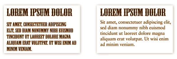
Compare the fonts shown in the example above. While a decorative font such as Wild West may be ok to use sparingly in your headline, that doesn’t mean it will also be a good choice for your body copy. Instead, opt for Garamond, Baskerville or Sabon. These tend to be among the most legible and readable serif typefaces for use in printed publications. These typefaces, also referred to as font families, offer different font styles (regular and italic) and weights (light, regular, medium, and bold) which gives the designer additional options for creating an easy-to-read article.
2. Intent: Does my chosen font deliver the right message?
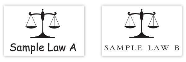
Compare the logos shown above. If you had to choose between the 2 law firms, which would you choose? I can guess that most anyone (hopefully) would choose the firm on the right. Why? Because the font used on the left, Comic Sans, is whimsical and childlike in nature, not the qualities one looking for legal advice would turn to. The font used in the example on the right is Serlio, which is a classic serif font set in small caps which works well to deliver the message of professionalism, experience and trust.
Likewise, if you are designing a logo for a children’s daycare center, make it fun, colorful and light-hearted!
*Friendly advice from the author: Please do not use Comic Sans. Ever.
3. Mood: How do you want the audience to feel?
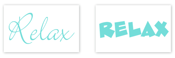
If your project could speak to you, how would it sound? Excited? Frightened? When choosing your font, consider the mood. Notice how both images say Relax. But how do the two compare to each other? The smooth curves and thin weight of the left image speak this perfectly and provides a calm feeling. Now look at the sharp edges and heavy weight on the right. Although the words are the same, this font visually changes the meaning and evokes a mood that is not relaxing at all.
4. Personal Preference: You are a designer for a reason, so be ready to explain!
Maybe the client is making a specific design request in asking to see the headline in XYZ font (that isn’t a real font that I know of) because they just really like it. Well, go ahead and show them their idea. It will communicate that you are listening. If you can assist in bringing their vision to reality and create a happy customer, I strongly suggest you do it! But do not be afraid to venture out and show them another idea (budget and time permitting). Designers design all day. We stay up to date with design trends. We know what we are doing. If we can show another direction and give an explanation to back up our statement, what is the worst that can happen? The customer can say “no” (which we hear a lot and is OK), or they can LOVE it and be happy we took the time and knowledge to give them our professional expertise. And, yes, we hear this a lot too.
In Closing…
Although there are no official rules to abide by, these are just a few guidelines to consider when choosing a font for your project. Read the words, understand the desired intent and message, and reflect it in print. Typography is an exciting part of your design, so have fun!
Did you like this blog post?
Get more posts just like this delivered twice a month to your inbox!
