

The role of advertising is to relay a message to the consumer. There are many media platforms in which this can be achieved, but if not used properly, the message can often be lost. Choosing what to emphasize can make or break a concept. That is why there are a few subconscious questions I like to ask before laying out a design.
What is your main focus?
This is the most important question you need to ask. If you had to take away everything else from the design, what is the one element that you absolutely could not live without? For example, if you are advertising a low interest loan, emphasizing that rate should be your focus. Likewise, images can also be equally important in emphasizing your message.

Does this layout work with the media platforms I am using?
Just because the layout you chose for one application works doesn’t mean it will work with another. Let’s say you were designing a poster for a celebration event. You may list a few key points about the event, as well as the date, time, or RSVP contact information.
In comparison, if you translated this same project to a web banner or billboard, you would not want to use the same type treatment. The reason being is that consumers spend less time viewing the piece, and these two advertising pieces are used as a gateway to more information. If you listed everything here, viewers may lose interest, or your key information would get lost. The number one priority is to make sure your message is heard loud and clear, not cluttered by unnecessary information.
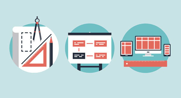
A Visual Checklist
Now that we know what our focus is, there are several ways to go about emphasizing that message. Here is a visual checklist that can pertain to a wide range of advertising uses:
Make it appealing.
This may seem obvious, but no one wants to look at something that is boring. I only bring this up because there is a lot of boring advertising out there. In a world where advertising is everywhere we look, grabbing a viewer’s attention has never been more important. The most successful designs make you pause because they are creative and use innovative thinking.

Guide the viewer’s eye.
When laying out a design, it is important to think about the order it will be viewed. Ideally, you will want to have the most important information first, and emphasized through the use of color, type size or weight. Do not emphasize too many things, or you may risk having several competing elements.

Create a call to action.
Now that you have their attention, it’s important to give the viewer an opportunity to learn more. This can be achieved by simply providing a link to your website, or an invitation to talk more personally.

Being intentional about what you highlight in your design is the number one priority. By being conscious about what you emphasize, you have a much greater chance of your message being heard!
Did you like this blog post?
Get more posts just like this delivered twice a month to your inbox!
